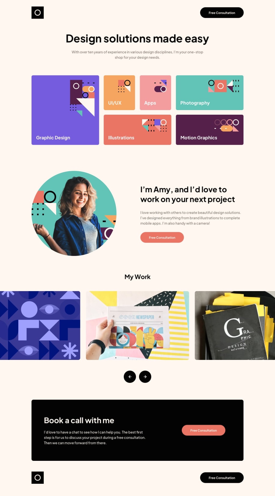
Design comparison
SolutionDesign
Solution retrospective
Hi everyone it's the first time when I used: • SCSS • BEM methodology • Swiper Js
In the slider section, I changed the behavior of the slider. Hope to have any useful feedback for my first landing page.
Community feedback
- @grace-snowPosted almost 2 years ago
Hi
There's lots of more detailed feedback I'd like to give on this but you've jumped to such a large project it would take a very long time so I'll have to rush through it I'm afraid
So, super quick things to fix until I have more time:
- look up how and when to write alt text on images
- include all the links Google fonts gives you in the head, in the exact order provided
- a logo and button is not a nav
- that free consultation link should be a link
- only 1 h1 per page... use headings but always in the right order for the content structure
- slider buttons must be buttons
- a logo home link needs to say what the site is and where the link goes
- never limit width of the body. This overflows my phone screen a lot as a result of that
- don't use explicit widths or heights (eg button styles can use padding)
- don't nest css selectors if one class will do
- you should never need a min-width: 320px media query. Try to work consistently mobile first
Marked as helpful0@izhuk5Posted almost 2 years ago@grace-snow Thanks for the feedback! I will fix those problems <3
0
Please log in to post a comment
Log in with GitHubJoin our Discord community
Join thousands of Frontend Mentor community members taking the challenges, sharing resources, helping each other, and chatting about all things front-end!
Join our Discord
