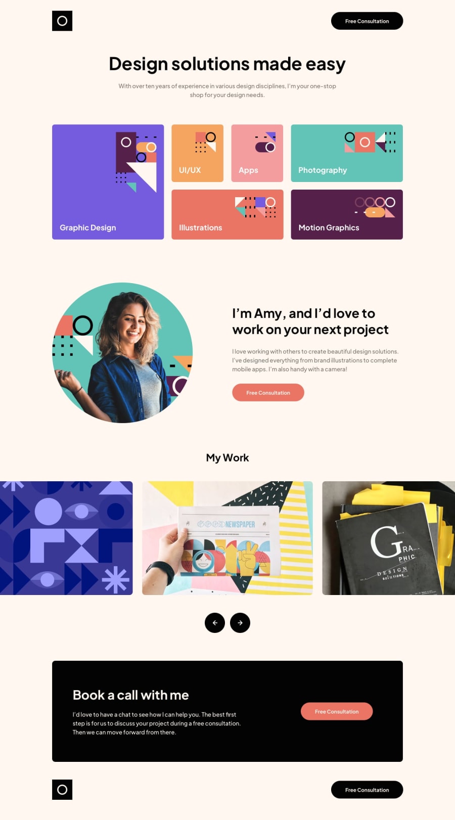
Single-page Design Portfolio | Grid/Flex | SwiperJS
Design comparison
Solution retrospective
Hey everyone, this is my first solution as a premium member! I'm very excited to continue finishing projects and improving my skills. This challenge definitely helped me improve my proficiency with Grid, the layout was not super tough thanks to Kevin Powell's Learn CSS Grid the easy way video.
I did struggle with implementing the carousel section, I found SwiperJS and configured that for the project. I'm very happy with the results, let me know if there is anything I could have done better!
Community feedback
- @grace-snowPosted about 2 years ago
A few small accessibility issues on here
- logo alt can’t just be logo (unless that’s the name of the site)
- work example repeated in every slide renders them meaningless. They need to have proper descriptions
- most of the sr only headings are unnecessary in this. You have headings already immediately underneath them.
- it’s unusual to have sections south articles inside sections. Articles are for encapsulated pieces of content that could be syndicated in other places/other sites. Sections are just like divs unless explicitly labelled. So it would be fine to have sections throughout this, or possibly articles, but not both for the same content
Marked as helpful1@grace-snowPosted about 2 years agoThe alt text issues are important, the others less so and more opinion than absolute
Overall this solution looks really great, you should be very proud of it!
And we’ll done for updating your readme! Most people overlook that
Marked as helpful1@jhellardPosted about 2 years ago@grace-snow Thank you so much for the feedback, I've just adjusted my solution with some changes, if you could take a look that'd be greatly appreciated!
I was getting some HTML validation errors as some sections did not really require a heading, I added the sr-only headings to get around it. How should I properly get around this error when the section doesn't need a heading?
EDIT: I've read up on this and thing I think I understand the use case better, if I have that error and that section doesn't need a heading maybe it shouldn't be a section in the first place? The MDN has a section about 'Using a section without a heading' where it does suggest using a hidden header for screen readers to force it into the document outline. I believe that may be the best solution in this case.
0@grace-snowPosted about 2 years ago@jhellard it would actually only go into the document outline if that section was “aria-labelledby” that heading in most browsers. But then it would be strange to have it there at all if there is an article directly underneath and no other “section” content.
I think this stuff is just your own preferences and doesn’t make a huge difference, just figure out how you like to do it and why. Don’t be afraid to use divs when that’s all it needs though
0
Please log in to post a comment
Log in with GitHubJoin our Discord community
Join thousands of Frontend Mentor community members taking the challenges, sharing resources, helping each other, and chatting about all things front-end!
Join our Discord
