Submitted over 2 years ago
Single-page design portfolio
#accessibility#lighthouse
P
@andreasremdt
Design comparison
SolutionDesign
Solution retrospective
Hey there,
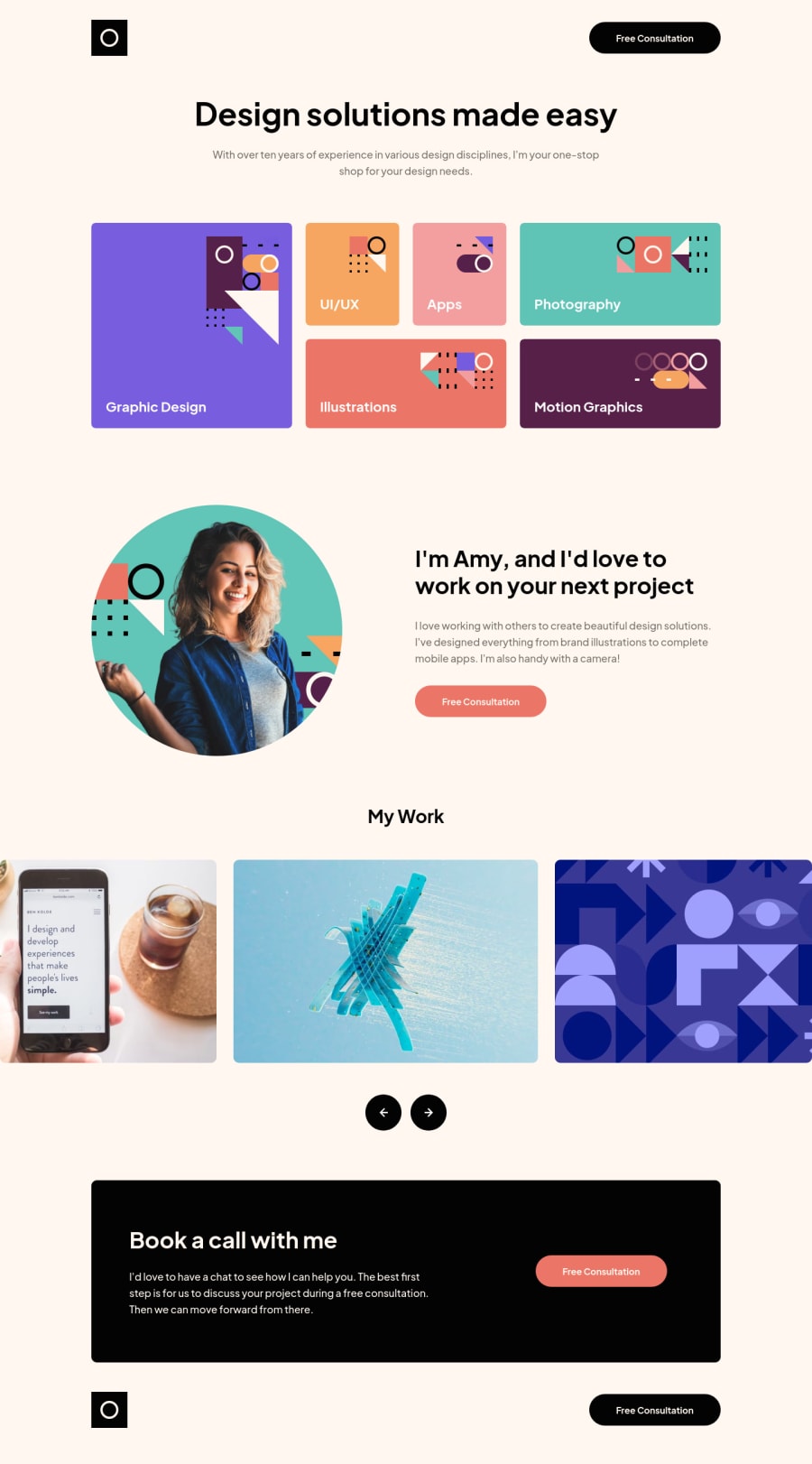
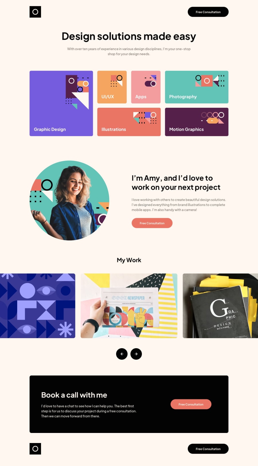
This is my solution to the single-page design portfolio. My goal was to make the markup as accessible as possible and the design as close to Figma as possible.
The slider is powered by Flickity, a lightweight JavaScript solution for accessible, touch-friendly, and easy-to-use slideshows.
Stylewise, the challenge was built desktop-first, introducing various media queries to break the layout whenever it started to look weird. Let me know what you think :)
Community feedback
Please log in to post a comment
Log in with GitHubJoin our Discord community
Join thousands of Frontend Mentor community members taking the challenges, sharing resources, helping each other, and chatting about all things front-end!
Join our Discord
