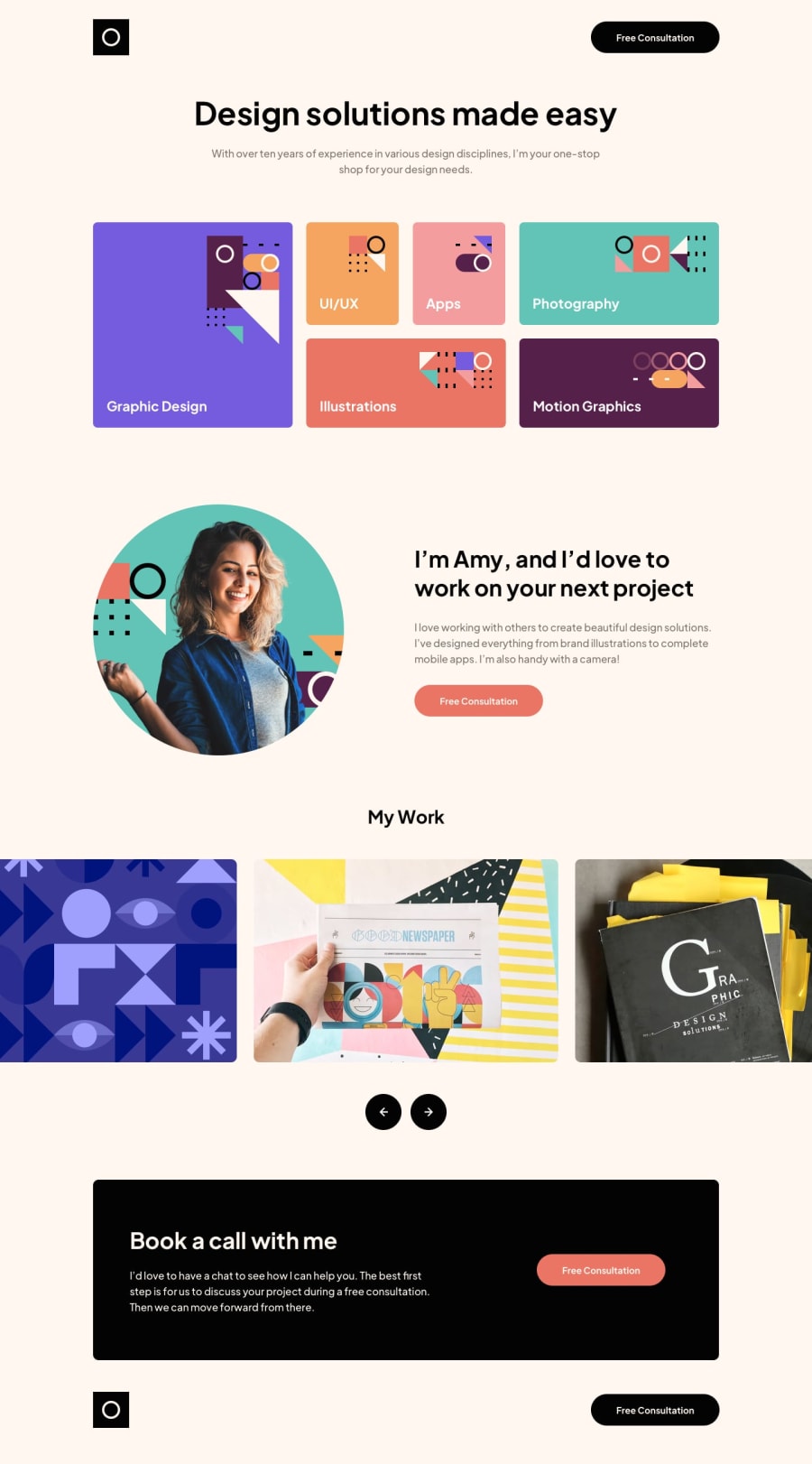
A responsive landing page using Flexbox, Grid and a little bit of JS.
Design comparison
Solution retrospective
It was an easy layout, but it was my first carrousel. I improvised using JavaScript and Css Clases.
Community feedback
- @OswalldPosted almost 2 years ago
Hey !
Here some things to make your code better :
1.Your responsive is not good beyond 1440px, on my screen ( 21:9 ) it is not scaling well ( the skill section, the header top, the contact section and the footer ), you can center them by using
margin: 0 auto;andmax-width:1440px.2.Try using sass/scss to make it more structured.
For your slider I wanted to do like you ( I also start in javascript ) but I found this way to be too messy, so I used a js library ( swiper).
Continue as your code is clean ! ( I think it is )
0
Please log in to post a comment
Log in with GitHubJoin our Discord community
Join thousands of Frontend Mentor community members taking the challenges, sharing resources, helping each other, and chatting about all things front-end!
Join our Discord
