Design comparison
Solution retrospective
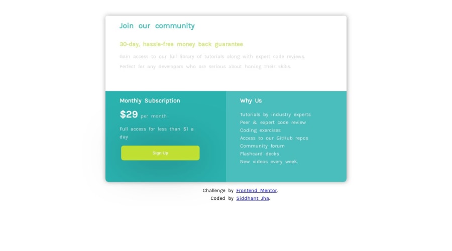
1)Out of 10 how much would you give to this? 2)how can i make the corners round if the div container contains other elements inside? 3)is it necessary to change border of all the container at the corners of a bigger container to get the rounded edges? 4)how to make grid the easy way? 5)please tell me the easy way to implement grid!!
Community feedback
- @GerbenDolPosted over 4 years ago
Hi Siddhant!
- I'd give you a 7 out of 10. If you'd nail the details like spacing and responsiveness a bit better I'm sure that would take it up a bunch! 🔥
- Simply use the
total-container
to set the border radius! Useoverflow: hidden;
to make sure the inner content stays inside. - With the above change you'll solve the problem of changes all the corners, as it's set on just a single element.
- The best way of using grid would of course be studying it and learning how to write the grid yourself. If you have trouble doing so check out this cool generator: https://cssgrid-generator.netlify.app/
- With the link to the generator above just build your grid, copy the code and implement it in your layout!
Good luck on your future challenges and don't forget to check out the resources page on here for links to grid tutorials! 😁
1@siddhantJHPosted over 4 years ago@GerbenDol one more question, how can i figure out the correct space between the elements as it is not mentioned in there any way?
0@GerbenDolPosted over 4 years ago@siddhantJH That's a great question and I'm sure more people struggle with this.
In a real world scenario you would obviously be handed over the design file where you can see all these specs. So, your number one solution would be to buy the design file for this challenge.
If that's not an option for you I recommend you get yourself some sort of image processing tool like Photoshop or a free alternative (maybe ask on Slack for people's advice on this) so you can open the image of the design and measure the pixel values of the spacing.
Of course it's also just a matter of practice - by building more you'll get a better feeling for getting the spacing looking great!
1@siddhantJHPosted over 4 years ago@GerbenDol thank's for the great advice, Have a nice day!.
0@siddhantJHPosted over 4 years ago@GerbenDol hey sorry to bother!, but i had gone through my solution and found that the mobile design is not working, ie on reducing the size of window it is not getting aligned as mobile layout.it is stuck in as desktop type. please help! i tried figuring it out but could'nt find the bug....
0@GerbenDolPosted over 4 years ago@siddhantJH Hey, no worries! I've got to go and have dinner and stuff now. But I'll be sure to help you get it working later today. 💪🏻
Just a quick edit: are you sure the solution on the live link is up to date? I don't see any media queries in your CSS at the moment.
0
Please log in to post a comment
Log in with GitHubJoin our Discord community
Join thousands of Frontend Mentor community members taking the challenges, sharing resources, helping each other, and chatting about all things front-end!
Join our Discord