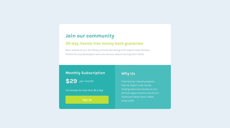
Design comparison
SolutionDesign
Solution retrospective
Leave your feedback on the code, and if possible, let me know if the semantics are correct, even better
Community feedback
- @MelvinAguilarPosted about 1 year ago
Hello there 👋. Good job on completing the challenge !
I have some suggestions about your code that might interest you.
- Use
<ul>and<li>for the content under "Why Us": Since the content is a list of items, it's more semantically correct to use an unordered list (<ul>) and list items (<li>) instead of using paragraph (<p>).
- The link should have the same color and height as your div with the class "button." The entire element should function as the link, not just the central part.
I hope you find it useful! 😄
Happy coding!
Marked as helpful2@AlyssonDemariPosted about 1 year ago@MelvinAguilar
I hadn't realized that 'Why Us' was a list of items. Thank you for pointing that out.
0 - Use
Please log in to post a comment
Log in with GitHubJoin our Discord community
Join thousands of Frontend Mentor community members taking the challenges, sharing resources, helping each other, and chatting about all things front-end!
Join our Discord
