single price-grid-component-master Using HTML & CSS


Design comparison

Solution retrospective
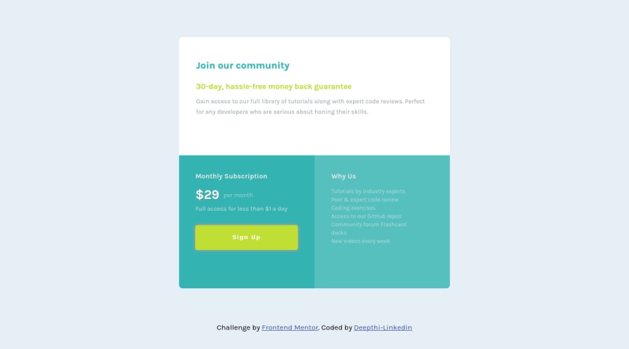
Hello everyone ! Here is the solution for single Price grid component which is totally responsive using HTML & CSS .My design may differ when viewed in different zoom of screen , so you guys can view the screen in 100% width. I do not know how to keep my screen static in different zoom .I am open to take any suggestions to improve code efficiency and make my design look better. Thank You
Community feedback
- @Sk7867Posted almost 4 years ago
Hello Deepthi-Ramesh 👋, Your solution great and is responsive on mobile and desktop view but it breaks at tablet view i.e.
width: 768px to 1000px. I suggest keepingwidthfixed or usingmin-widthormax-widthproperty to prevent it from shrinking or expanding too much as width of screen changes.Also give
box-shadow: 0px 8px 15px rgb(0 0 0 / 10%)effect tobuttonso it pops up a bit. You can also mess with hover effects. Happy Codding😁Marked as helpful0@Deepthi-RameshPosted almost 4 years ago@Sk7867 Thank you .I was struggling to solve that width problem. Thank you for your suggestion.
0

Please log in to post a comment
Log in with GitHub
Join our Discord community
Join thousands of Frontend Mentor community members taking the challenges, sharing resources, helping each other, and chatting about all things front-end!
Join our Discord