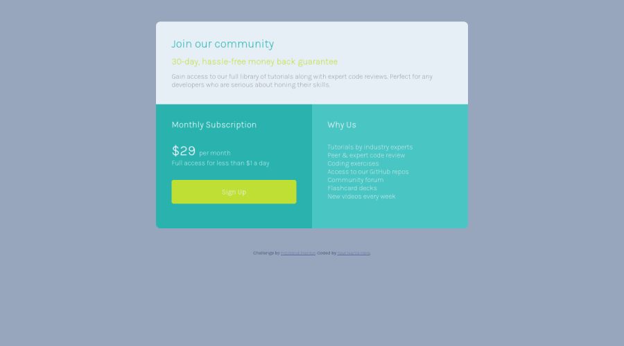
Design comparison
SolutionDesign
Solution retrospective
Hi, any feedbacks are welcome.
Community feedback
- @SzymonRojekPosted almost 4 years ago
Hi Dina,
@SeyideHundeyin already mentioned important thing but also I've checked you HTML structure, a few tips from me:**
- remove CSS styles and transfer them to the CSS file;
- instead of the div "container" you can youse the main tag;
- the tag header is not needed here, in this project it is better to use section for all these three cards (every card can be a div);
- this is a single page component so you can use the h1 tag and two spans inside (heading-main: Join our community and heading-sub: 30-day, hassle-free money back guarantee) or h1 and below h1, then in the card 2 and 3 add the h2;
- h1 shouldn't be added to the price and per month, here you can use the p tag and span inside of it);
- instead of a button I'd recommend using a link;
- check your project on different devices by the inspector in your browser. You should start from one column (on mobiles), then on tablets you can create the design pattern;
- start to build this project from the mobile first.
I can recommend two courses providing by Wes Bos for free:
Greetings :D
1@dinaPutrimpPosted almost 4 years ago@SzymonRojek Thank you very much for your tips. I will rewrite again.
0@SzymonRojekPosted almost 4 years ago@dinaPutrimp
Great, have a nice coding time :D
0 - @SeyideHundeyinPosted almost 4 years ago
Hi Dina,
I would recommend you making this responsive on mobile devices and changing the background color to match the design file.
Have a nice day!
0
Please log in to post a comment
Log in with GitHubJoin our Discord community
Join thousands of Frontend Mentor community members taking the challenges, sharing resources, helping each other, and chatting about all things front-end!
Join our Discord
