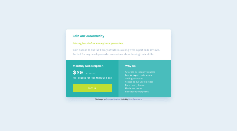
Design comparison
Solution retrospective
Hey, this is my first finished frontend project. I'm a unexperienced newbie so far and would be very thankful for your valuable feedback.
Questions:
-
I tried to center the price grid with flexbox horizontally and vertically. For that I had to set the height to 100%. Problem: If I open the site on a small mobile device, I can't scroll. Do you have a solution for me? I tried stuff like to work with min-height, but it didn't help...
-
I wasnt sure when I should use dynamic margin/paddings and when I should use static ones. I decided to use for my layouts inside the boxes static paddings so that the result matches with the design mockup as good as possible. Is this a good practice that way or should I avoid static paddings in general?
-
Any other suggestions on what topics I should pay close attention for my upcoming projects?
Thanks :)
Community feedback
- @ApplePieGiraffePosted about 4 years ago
Hey, Rene Sauerwein! 👋
Good job! Your solution looks good and responds well! 👍
And congratulations upon completing your first challenge on Frontend Mentor! 🎉
- You should be able to fix this problem by adding
min-height: 100vh;instead ofheight: 100%to thebodyof your page. Just make sure to add somepadding-topto thebodyso that the card component is right up against the top edge of the page. - I don't think you need to worry about using dynamic margin/padding very much. Most designs look great with static margin/padding and you usually only need to think about changing the static margin or padding when you switch from the desktop to the mobile layout of the site or something (which you can easily do with an existing media query). But if you'd really like to use dynamic margin/padding (like by using
vhorvwunits), go for it! Just make sure the margin or padding doesn't become too much on very large desktop screens or too small on mobile screens (which is another reason static margins/padding work pretty great but you can use theclamp()function to keep your dynamic margin/padding from going crazy). Most solutions just use static margin/padding. - I suggest adding a hover state to the button and a border-radius to the bottom of the card in the mobile layout of the site.
Keep coding (and happy coding, too)! 😁
2@rsauerweinPosted almost 4 years ago@ApplePieGiraffe Hey, thanks for your valuable feedback.
- I adjusted the min-height to 100vh and it works fine now
- Ok, so I don't worry too much about static paddings/margins for now. I was just concerned, that static values maybe isn't a good practice
- button:hover - done
One last question: About
border-radius: Is there maybe a smarter way to solve that one? What bothers me is that I had to attach the border-radius to different sectionsFor desktop I had to apply the border radius to:
.container,.why-us,.monthly-subscriptionWould be nice if there is a way to attach the border-radius only to
.containerfor example instead of attaching it to three different classes..0@ApplePieGiraffePosted almost 4 years ago@rsauerwein
Oh, yeah! Just set a
border-radiuson the.containerclass and setoverflowtohiddenso that none of the boxes inside the card component are visible outside the border-radius of their parent container. That should do the trick! 😉1@rsauerweinPosted almost 4 years ago@ApplePieGiraffe Thank you so much. Now it's fine and I have also learned a lot. Looking forward for my next project :)
See you, cheers
0 - You should be able to fix this problem by adding
Please log in to post a comment
Log in with GitHubJoin our Discord community
Join thousands of Frontend Mentor community members taking the challenges, sharing resources, helping each other, and chatting about all things front-end!
Join our Discord
