


@bccpadge
Posted
Hello @hakylepremier. Congratulations on completing this challenge🎉!!
I have couple tips to improve your solution.
CSS 🎨:
- Font size should never be in pixels because it is not accessible for everyone.
More info 📚:
Font size shouldn't be in pixels
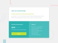
- When I switch to mobile responsiveness your single price grid component cuts off at the top. Also, you need more space on the bottom as well. To fix this issue you can add this code below.
body{
   padding-block: 10rem;
}
- On desktop you can remove the padding altogether to make sure the component is in the center of website using a media query.
Padding block is a logical property in CSS which means top and bottom.
More info 📚:
Hopes this helps you and don't hesitate to reach out to me if you have any questions.
Marked as helpful
@hakylepremier
Posted
@bccpadge
Thanks for pointing out the mobile responsive issue. I probably wouldn't have caught it otherwise. I think it's because I test my mobile responsiveness using a taller screen that's why I didn't see the issue.
I will definitely take your suggestion on font size in my future projects.
PS: your solution has been tested and implemented in the live site now so that solves the issue.
