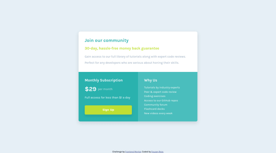
Design comparison
Solution retrospective
Hello everyone! I want to make my solution close to the design but I think I missed some parts so it's not 100% percent similar. If you know what I can improve from my solution, just drop your feedback and I will appreciate that. Thanks
Community feedback
- @adarshcodesPosted almost 4 years ago
Hi @codebyfauzan, your design is really very similar to the actual design provided. Good job👏.
- Design aspect: You did great in the design.
- Responsive aspect: It is well responsive to most of the screen sizes.
- Code aspect: as @SzymonRojek gives you tips for the semantics you can take care of that and also for the multiple paras you can use a single para with breaks, but in this case, if you see carefully, you yourself find out that
li'swould be great for the purpose because it's showing the reason to choose. - Issues aroused: Great! no HTML or Accessibility issues aroused. Happy Coding : )
3@SzymonRojekPosted almost 4 years ago@adarshcodes
Thanks, your comment is very valuable. I've just edited my comment and added more information about button - because of accessibility, what choose and when: links or buttons.
1@codebyfauzanPosted almost 4 years ago@adarshcodes Thanks, I will try to apply your feedback.
0 - @SzymonRojekPosted almost 4 years ago
Hi Fauzan,
I like your solution! Looks great, good job!
I would like to give you a few tips:
- you don't have to style the footer in the HTML, transfer styles to the CSS file;
- semantic tags: it is not good to use so many divs in the HTML structure;
Generally, divs are semantically inert elements — elements that don’t really do or say anything. The term "semantic" refers to the meaning of a word or a thing, so "semantic elements" are elements designed to mark up the structure of a document in a more meaningful way, a way that makes it clear what they're for, what purpose they serve in the document. Check the MDN documentation. Therefore, it will be amazing to use semantics tags like main, section, article, header etc. You can divide the semantic block elements into two categories: primary structure (for example header, main, footer, then divide those regions into sections) and content indicators. There are lot's of tags and it is worth getting to know them gradually.
- in the third card you can use the list ul/li instead of lots of paragraphs;
- you can add hover and active status to the button. Also, read the documentation about accessibility because at the moment button doesn't have important attributes - I can recommend this article from the Smashing Magazine A complete guide to links and buttons.
That's it from me. Ps. don't forget to upvote any comments on here that you find helpful.
Greetings :D
2@codebyfauzanPosted almost 4 years ago@SzymonRojek Thanks, really appreciate that. I will try to improve my code
0
Please log in to post a comment
Log in with GitHubJoin our Discord community
Join thousands of Frontend Mentor community members taking the challenges, sharing resources, helping each other, and chatting about all things front-end!
Join our Discord
