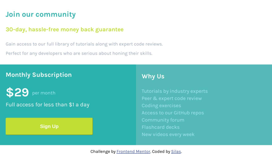
Design comparison
Solution retrospective
This is only the second website I've made without having my hand held by a tutorial. I struggled with the responsiveness at first but then scrapped all of that and went with a mobile-first way of thinking. Learned a lot along the way. Let me know if you see anything that could be better. Thanks!
Community feedback
- @lailton-bPosted almost 5 years ago
Congratulations, it was very good!
To be more like the original you could wrap all the content inside two div's.
In the first div you would put width and height 100%, in the second you would measure exactly the size of the content given in the original design and assign it to it.
Returning to the first div you would put the same background color as the original design and assign the following properties: display: flex; justify-content: center; align-items: center;
That way the content would be aligned to the center and not occupying the entire screen, giving more comfort to the eyes. But there is a problem, if you do this it will probably break the website, so if you don't want to fix it, leave it at that, hahah!
1@DangerCat88Posted almost 5 years ago@lailton-b If I get time, I might go back to revisit this one and try out your idea. Just to see what I can do with it. Thanks for the tips!
1@lailton-bPosted almost 5 years ago@DangerCat88 You're welcome!! Have a nice study!
0 - @l3rodeyPosted almost 5 years ago
This is actually really cool!
0
Please log in to post a comment
Log in with GitHubJoin our Discord community
Join thousands of Frontend Mentor community members taking the challenges, sharing resources, helping each other, and chatting about all things front-end!
Join our Discord
