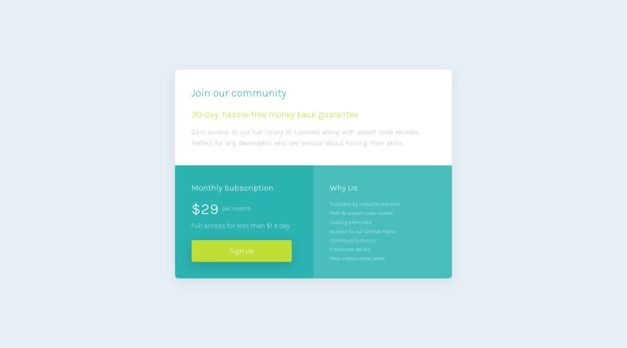
Design comparison
SolutionDesign
Solution retrospective
I tried to do the desktop design with grid initially, but couldn't get it quit right. Any tips or links to such solutions are welcome. Also my concern is that maybe I'm writing too much css, so if anyone could link their solution/code for me to study, I find it very helpful to look at code of more experienced devs.
Community feedback
Please log in to post a comment
Log in with GitHubJoin our Discord community
Join thousands of Frontend Mentor community members taking the challenges, sharing resources, helping each other, and chatting about all things front-end!
Join our Discord
