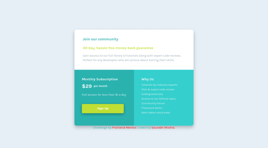
@AngelusLovell
Posted
@xstrafez you did not use the min and max media queries the right way. Which resulted in your design breaking, below 300px.
Personally, I do not use them together in the same queries.
@Saurabh-Mishra04
Posted
Hey @ShashaGazem! Thanks for the feedback but I already knew that. I didn't want the design to be responsive below 320-325px.
If you don't mind can you share with me how you would use the queries. (By the way was this comment for me or @xstrafez cuz you mentioned him.)
Thank You!
@ShashaGazem and if you design mobile first then you are only assigning media queries in one direction anyway
@AngelusLovell
Posted
@Saurabh-Mishra04 I use media queries defining my design in one direction, mobile-first in my case. Using min and max together is never wrong, but I simply felt writing in such a way would lead me to confusion when I later try to make a change to the code.
And I feel like designing in one direction is structurally consistent. If that makes any sense.
I will be honest I simply wanted to post my first comment, and felt using min and max together is a little dangerous, so without actually confirming i simply pointed it. 😅