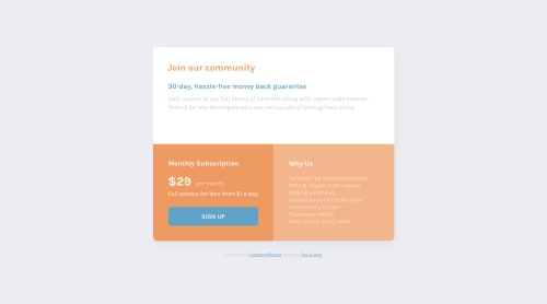
Design comparison
Solution retrospective
Change the default color to orange and blue, and add a light box-shadow design. But still couldn't do well in mobile version, and have problem to make the button work properly.
In the first time I use button element, then swap with a link, and it works slightly different. In what case we will use button, not a link?
Cause, the course I took before, they also make button by a link. And this confuses a little.
Please log in to post a comment
Log in with GitHubCommunity feedback
- P@12Kentos
Hey @ponhuang,
Nice job on the project! Normally I don't like when people make changes to the color scheme of the projects, but I think you did a good job. :)
As for the question regarding buttons and links, I think it depends on the purpose you have in mind. For instance is the button going to take them to a different page? Or is it part of a form submitting some information?
Depending on the situation, it is easier to use one over the other because of the inherit difference they both have. Personally I like to style a link as a button, as I have more practice with that so I find it easier. However if it is going to be in a form, I would definitely use a button rather than a link.
Here's a nice two minute video I found explaining the differences between them, and when to use which one.
Keep up the great work!
- @stephenikuomola
- Hello Pon Huang!!!
Increase the line-height of the description class to about 1.5 or you multiply your font-size by 1.5 to get an appropriate font size in px's.
Just had a look at your code and I think the reason you are having issues with mobile version was because you made the container have a width of 50vw at a media query which has a max-width of 45rem. I personally think it's best you work with rem or px units in this situation. So you can do something like this:
container{ width:85%; max-width:380px}
or you could also do thiscontainer{ width= min(85%, 380px}
Then finally on that same container class you can add a
margin-inline:auto
ormargin:0 auto
ormargin-right:0
thenmargin-left:0
.I think this solves your problem with the mobile version.
Happy Coding Pon Huang :)
- @Yasmine10
Hi Pon 👋
To fix the mobile version you just have to change the following:
.container { max-width: 63.5rem; // what you have now width: Min(90%, 63.5rem); // change it to this }
The reason a button and a link work a little different is because their default styling is different.
Also here are some resources to better understand the difference between a link and a button.
- https://a11y-101.com/design/button-vs-link
- https://medium.com/design-code-repository/a-vs-button-b859547cae4d#:~:text=In%20%2C%20there%20is,%3D%E2%80%9Dbutton%E2%80%9D%20for%20semantic.
Hope this helps!
Join our Discord community
Join thousands of Frontend Mentor community members taking the challenges, sharing resources, helping each other, and chatting about all things front-end!
Join our Discord