Design comparison
SolutionDesign
Solution retrospective
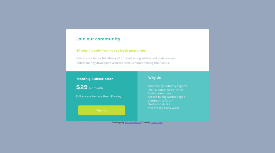
Hi guys, i've finally managed to make my first responsive challenge but I still had one little issue with the background on the mobile version. Could you give me a feedback or a tip on how to solve it or make my code cleaner. Thanks =]
Community feedback
Please log in to post a comment
Log in with GitHubJoin our Discord community
Join thousands of Frontend Mentor community members taking the challenges, sharing resources, helping each other, and chatting about all things front-end!
Join our Discord
