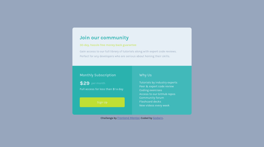
Design comparison
Community feedback
- Account deleted
Hello @itadori-kun,
Your solution looks good and I have some tips to improve your solution:
- You applied the incorrect background color and change it to this
background-color: hsl(204, 43%, 93%); - Join Our Community section should have the
background-color: white;
I hope this helps you
1@itadori-kunPosted about 2 years ago@bccpadge Thank you so much for the observation and the guide. Was actually looking for the color. Thanks
0 - You applied the incorrect background color and change it to this
- @VCaramesPosted about 2 years ago
Hey @itadori-kun, some suggestions to improve you code:
-
Your button is missing
:hoverand abox-shadow. -
The “Why Us” list should be created using an Unordered List Element along with the List Items Element.
-
Implement a Mobile First approach 📱 > 🖥
With mobile devices being the predominant way that people view websites/content. It is more crucial than ever to ensure that your website/content looks presentable on all mobile devices. To achieve this, you start building your website/content for smaller screen first and then adjust your content for larger screens.
- Your content is not fully responsive. Here is a link to Google Developer’s site that will teach you how make it 100% responsive:
Happy Coding! 👻🎃
0@itadori-kunPosted about 2 years ago@vcarames Thank you so much for the wonderful feedback. Will try to correct the issues stated
0 -
Please log in to post a comment
Log in with GitHubJoin our Discord community
Join thousands of Frontend Mentor community members taking the challenges, sharing resources, helping each other, and chatting about all things front-end!
Join our Discord
