Submitted almost 2 years ago
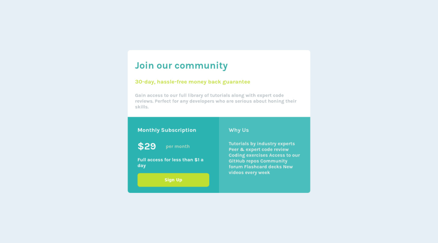
single-price-grid-component-master with Html, css and page reponsive
@wadmortada
Design comparison
SolutionDesign
Community feedback
- @VCaramesPosted almost 2 years ago
Hey there! 👋 Here are some suggestions to help improve your code:
- The
articleelement is being used incorrectly ⚠️ and not needed for this challenge .
- Avoid skipping heading levels ⚠️. Always start with the
h1(which can only be used once) and you will go down the hierarchy level depending on the heading’s level of importance.
- The “30-day, hassle-free money back guarantee” is not a heading❌. It should instead be wrapped in a
paragraphelement.
- The button was created with the incorrect element ❌. When users click on the button they should directed to a different part of your site; the
anchorelement will allow this to happen.
More Info:📚
- The “Why Us” list needs to be created using an
unordered list ⚠️element along with thelist itemelement.
- Your
CSS Resetis being underutilized. 😢 To fully maximize 💯 it, you will want to add more to it. Here are some examples that you can freely use 😁: Josh Comeau Reset Eric Meyer Reset
- To properly center ✅ your content to your page, you will want to add the following to your
body(this method uses CSS Grid):
body {
    min-height: 100vh;
    display: grid;
    place-content: center;
}
More Info: 📚
If you have any questions or need further clarification, feel free to reach out to me.
Happy Coding! 🎆🎊🪅
Marked as helpful1@wadmortadaPosted almost 2 years ago@vcarames thank you for info and feedback it help me alot
1 - The
Please log in to post a comment
Log in with GitHubJoin our Discord community
Join thousands of Frontend Mentor community members taking the challenges, sharing resources, helping each other, and chatting about all things front-end!
Join our Discord
