Design comparison
SolutionDesign
Solution retrospective
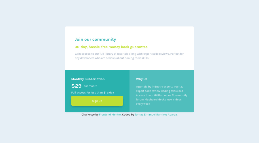
Hi community, I built this component as closer than i can, any feedback is welcome 😁
Community feedback
- @hyrongennikePosted about 2 years ago
Hi @emanuel-ra,
- Good job on the challenge* just a small change I would suggest is to make the following change in the media query set the width to 800px or what every looks close to the design for you.
@media (min-width: 1024px) {
.card {
    max-width: 800px;
}
}
also set the padding to 3rem for all the divs in the .card div looks cleaner. Hope this helpful
1@emanuel-raPosted about 2 years ago@hyrongennike Thanks for helping me 😁
0
Please log in to post a comment
Log in with GitHubJoin our Discord community
Join thousands of Frontend Mentor community members taking the challenges, sharing resources, helping each other, and chatting about all things front-end!
Join our Discord
