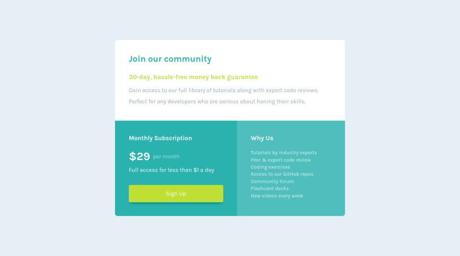
Design comparison
Solution retrospective
Feedback are very much appreciated, have a good day everyone! :)
Community feedback
- @Nishkarsh01Posted over 3 years ago
Could you please help me understand the
place-valueproperty that you used on body. Could not understand it over documentation. Would be great if you could take the time to help.Also, I loved the way you've written and organised your code. Really Beautiful.
0@FluffyKasPosted over 3 years ago@Nishkarsh01 Hey, place-items is basically just a shorthand for align-items and justify-content properties. You can use it together with grid. On the body I used it to both horizontally&vertically center my component. I hope this helps ^^
Also, thanks :)
1 - @palgrammingPosted over 3 years ago
Good start to the challenge. You might want to look at your layout in a browser about 750px wide and just look at your text alignment and how all your elements are reacting together. Specifically in the middle card the Price Text and how it is compared to all its siblings
0@FluffyKasPosted over 3 years agoThanks, I didn't notice I messed up that flexbox. Corrected. :)
0
Please log in to post a comment
Log in with GitHubJoin our Discord community
Join thousands of Frontend Mentor community members taking the challenges, sharing resources, helping each other, and chatting about all things front-end!
Join our Discord
