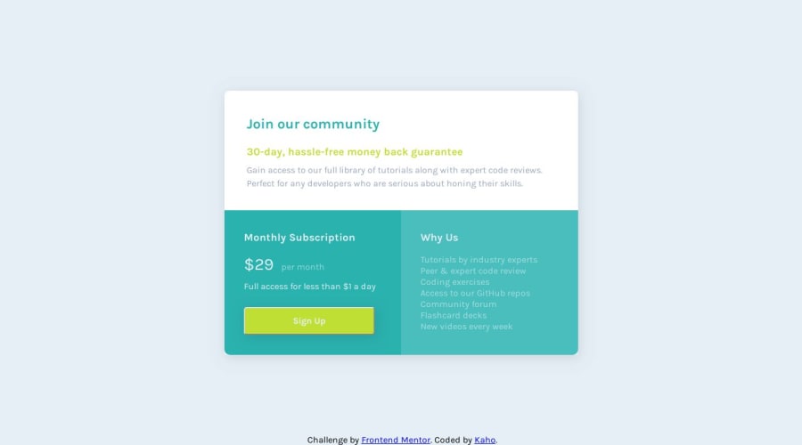
Design comparison
SolutionDesign
Solution retrospective
Hi, thank you for checking my solution! Here are my questions. It would be great if you answer or leave any suggestions. Thank you :)
-
Are there any better ways to place the component itself in the center of the entire page?
-
How would you make a space around in each section?
- I set the padding for each to colour them, and put box-shadow to the whole. You can find the tiny edges on the bottom corners...they don't look pretty.
-
I still don't get used to the elements overflowing from its parent's element...am I missing something to know to get this fixed? Any suggestions to learn about this?
Community feedback
Please log in to post a comment
Log in with GitHubJoin our Discord community
Join thousands of Frontend Mentor community members taking the challenges, sharing resources, helping each other, and chatting about all things front-end!
Join our Discord
