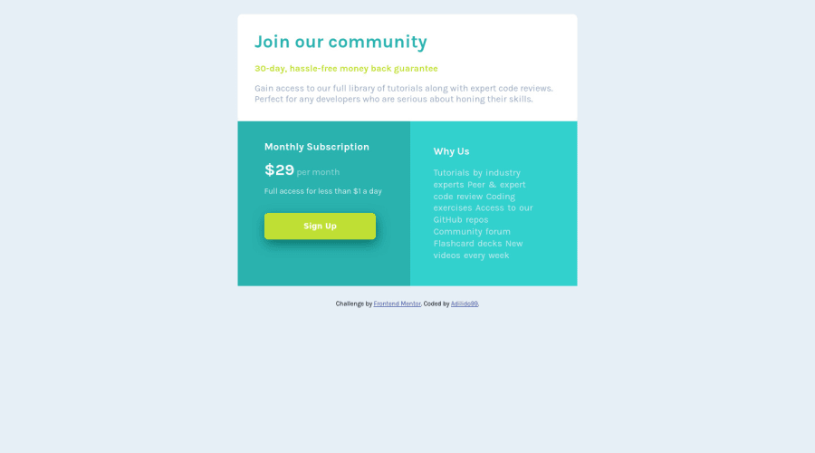
Design comparison
SolutionDesign
Solution retrospective
feel free to leave any feedback :) , wish you a nice day Slack Community :)
Community feedback
- @vanzasetiaPosted over 2 years ago
Hello there! 👋
Congratulations on completing this challenge! 🎉
I have some feedback on this solution:
- Accessibility
- Don't use
headerfor the card content since it is not a full webpage. This is one chunk of content that all belong together and in a real website would sit with other content. - Put the attribution or the
footeroutside themainelement. btag has been deprecated. Usestrongtag instead.- The Monthly Subscription section should not be a
ul. - I think the Sign Up button should be a link instead a button. What do you think it's going to happen if the user the click the button?
- Always specify the
typeof thebuttonto prevent the button from behaving unexpectedly (like submitting). - The Why Us section should be
ulinstead of a paragraph. It would make sense if it's read as a list instead of as a sentence. - Use
remor sometimesemunit instead ofpx. Usingpxwill not allow the users to control the size of the page based on their needs.
- Don't use
- Styling
- To make the card perfectly in the middle of the page, you can make the
bodyelement as a flexbox container.
- To make the card perfectly in the middle of the page, you can make the
/** * 1. Make the card vertically center and * allow the body element to grow if needed */ body { display: flex; flex-direction: column; align-items: center; justify-content: center; min-height: 100vh; /* 1 */ }- Best Practice (Recommended)
- Remove the commented code. If another developer (it can be you in the future) wants to improve this solution, he/she might get confused about whether or not the commented code should be used or deleted.
That's it! I hope this information is useful! 😁
Marked as helpful1@adilido99Posted over 2 years agothank you so much for all these informaions and tips, i am sure that if i apply what you've said it will improve my code and make it better. i thank you again for your feedback@vanzasetia
1 - Accessibility
Please log in to post a comment
Log in with GitHubJoin our Discord community
Join thousands of Frontend Mentor community members taking the challenges, sharing resources, helping each other, and chatting about all things front-end!
Join our Discord
