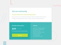
Design comparison
Solution retrospective
Please Kindly leave your feedback .Thank you.
Community feedback
- @AminduSasankaPosted over 2 years ago
Good job and nicely done. I have proposed some changes to your code to center the whole component. check it out.
Marked as helpful0 - @Bayoumi-devPosted over 2 years ago
Hey! Here are some suggestions:
-
Heading levels should only increase by one, Make sure you are using the headings in order...Ordered headingsmake it easier to navigate and understand when using assistive technologies. -
You have used
flexboxto center the component on the page, but you need to addjustify-content: center;to the body:
body{
    background: var(--light-Gray);
    font-family: 'Karla', sans-serif;
    font-size: 16px;
    min-height: 100vh;
    display: flex;
    align-items: center;
    justify-content: center;    /* <--- Add */
}
.container{
    max-width: 960px;
    /* margin: 0 auto;          /* <---- Remove */
    /* margin: 2rem 1rem;          /* <---- Remove */
    padding: 2rem;    /* <--- Add */
}
I hope this is useful to you... Keep coding👍
Marked as helpful0 -
- @VANIMEHTAPosted over 2 years ago
Try to position this container in center it would look neater. You can do this by giving equal margins from top and left in % to your container. Also I guess you forgot to add hover state to the signup button.
Marked as helpful0
Please log in to post a comment
Log in with GitHubJoin our Discord community
Join thousands of Frontend Mentor community members taking the challenges, sharing resources, helping each other, and chatting about all things front-end!
Join our Discord

