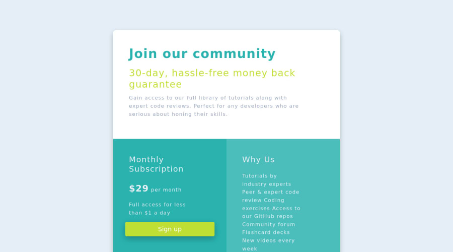
Single Price Grid Component using HTML, Scss, and Bootstrap
Design comparison
Solution retrospective
Hi all, please checkout my submitted solution. It will be a pleasure to know your perspective, experiences, etc. when developing a website.
Feel free to comment on:
- suggestion to better solutions (or avoid using 'hacks' :D)
- some nit-picks to a more beautiful and responsive front-end design
- development cycle used for faster and efficient process of building a website.
- other advice related to this challenge
Challenges encountered:
-
Border Radius. I used a hacky way to do it. Please see the live site > scss > media queries > border-radius.
-
Sticky Footer. I used a hacky way to do this. (please see live site > html)
- from html, I added class of h-100.
- from body, class="d-flex flex-column h-100"
- from main, I class="flex-shrink-0"
- from footer, I used container class inside the tag
Notes:
- I do not have the same background as the one in the challenge. The repository that I downloaded does not have a background image included.
Community feedback
- @alex-kim-devPosted over 3 years ago
Hey! A little suggestion on the
border-radius. Do you know you can apply it only to the container along withoverflow: hiddenso it cuts the pointy angles of container's children? You can use it for larger screens, and for mobile just set the radius to 0.Also you can use Codepen's full page view link to make a nicer screenshot, however it's still going to mess up the a11y/html report.
Nice job overall and have fun coding!
Marked as helpful1@die-lowenkoniginPosted over 3 years ago@Alex-K1m, I see, thank you Alex for the suggestion on codepen. I'm totally new on using frontendmentor.io as well as the codepen. (I'm fairly new to web development as well)
I'll also try what you suggest for border-radius so I can keep my code cleaner.
regards, leo-jp
1@die-lowenkoniginPosted over 3 years ago@Alex-K1m, I updated the codepen link. It looks a bit nicer but still not quite there.
Might I ask what are you usually using as live site for better screenshot of the solution?
sincerely, leo-jp
0@alex-kim-devPosted over 3 years ago@die-lowenkonigin I keep my code at Github and I usually use Github Pages for hosting, it's free & super easy to set up. Another great option would be Vercel. And yeah, the screenshot itself isn't that important, but the report can give some good insights.
Marked as helpful0 - @AngelusLovellPosted over 3 years ago
Bro,
why do u have your code like that.🤔 Create a github repo commit your challenges and host it there.
0@die-lowenkoniginPosted over 3 years ago@ShashaGazem, yes, I linked the Github repository as well as the Codepen live but from what your comment was, it looks like the frontendmentor.io does not show my link... I'll try to edit my submission so anyone can see.
Update: double checking my current post, my github and codepen live link is shown when you click "preview site" or "view code". I'm not sure what do you see on your end. If only I could submit how I see in my end then you may see the buttons that I'm referring to.
Re: I think what you're mentioning is the design comparison section issues. I'll try to move out my code from codepen to github.io or similar sites.
0
Please log in to post a comment
Log in with GitHubJoin our Discord community
Join thousands of Frontend Mentor community members taking the challenges, sharing resources, helping each other, and chatting about all things front-end!
Join our Discord
