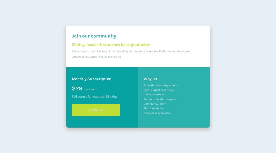
Design comparison
SolutionDesign
Solution retrospective
I tried to make it as close to the design as I could but if there is any part where I can improve I will love your feedback.
Community feedback
Please log in to post a comment
Log in with GitHubJoin our Discord community
Join thousands of Frontend Mentor community members taking the challenges, sharing resources, helping each other, and chatting about all things front-end!
Join our Discord
