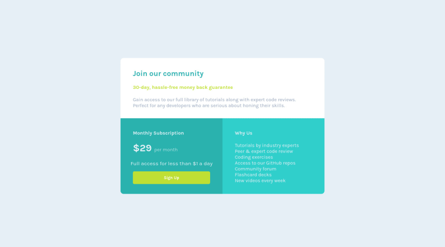
Design comparison
Solution retrospective
This is my seventh challenge from frontend mentor. Warmly welcome for any comments and suggestions
Community feedback
- @FluffyKasPosted over 3 years ago
Hey there, your solution looks great and works well on all screen sizes. The only issue I have with it is how you use headings. You should always start with <h1> for the main title of the page and work your way down from there, one by one. Although headings have default styles, their semantic meaning is more important. For styling headings, there's css ^^ Kevin Powell actually explains this much better and in more detail in one of his recent videos, I recommend checking it out.
One more thing, but this is really a minor detail: you could add a
cursor: pointerand a hover state for your button, it would be a nice touch :)Good luck!
Marked as helpful1@CleanCoderKPosted over 3 years ago@FluffyKas thanks for your detail comments. I had changed my code based on your comments. Really thanks again for giving me great ideas
0
Please log in to post a comment
Log in with GitHubJoin our Discord community
Join thousands of Frontend Mentor community members taking the challenges, sharing resources, helping each other, and chatting about all things front-end!
Join our Discord
