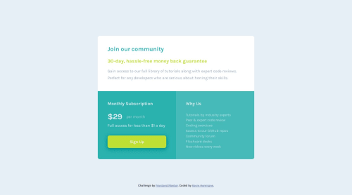
Single price grid component using Grid, rem units, media queries
Design comparison
Solution retrospective
My feedback and difficulties mostly came from responsive design adjustments with Grid and rem units. Here's where I need feedback:
- Use of CSS Grid; I did a mobile-first workflow, and didn't implement Grid until the larger breakpoints; seems like there may have been a better way to use this and write less CSS for the breakpoints
- Use of rem units; mobile-first was fine, but then going to large screens made everything seem too small, so I made a lot of manual size adjustments in the breakpoints; again, feels like there would have been a better way to master rem (and maybe em) units so that the size adjustments happen automatically for breakpoints
Otherwise, I welcome feedback about any other observations. Thank you!
Community feedback
- @vanzasetiaPosted over 1 year ago
Hi, Kevin! 👋
My feedback for the two mentioned points:
- You only need to use one media query to switch the card from the one-column layout to the grid layout. You do not need to define
grid-template-rows: auto;
on the.container
. That is already the default behavior. After that, you do not need to define thegrid-column: span 1;
on the second and third grid items. Try removing them and see if there is any difference. - You do not need to adjust the font size for larger screen sizes. You do not need media queries for the font sizes. On all screen sizes, the font sizes are the same. So, you only need a media query to switch the card's layout.
People with large screen sizes will zoom in or increase the zoom level. So you do not need to worry about making adjustments for large screen sizes such as those above 1440px.
Here are a few suggestions for improvements:
- No extra element: Use the
<main>
element as the.container
instead of having another<div>
element. - One
max-width
: You only need to specify onemax-width
for the.container
. You should put themax-width
as the base styling of the.container
. - Do not use pixel unit for font sizes: Use
rem
orem
instead ofpx
for font sizes. Never usepx
unit. Relative units such asrem
andem
can adapt when the users change the browser's font size setting. Learn more — Why you should never use px to set font-size in CSS - Do not change the
<html>
or the:root
font size: It can cause huge accessibility implications for those users with different font sizes or zoom requirements. Grace Snow explains the issue clearly—Should I change the default HTML font-size to 62.5%?—and Joshua Comeau also does not recommend that approach—The Surprising Truth About Pixels and Accessibility: should I use pixels or rems?. - Do not specify default styling: Remove
font-size: 1rem
from the<body>
styling. It is already the default styling.
I hope this helps. Happy coding! 👍
Marked as helpful0@kevinx9000Posted over 1 year ago@vanzasetia Thank you for taking a look at my code, and for your feedback! I greatly appreciate it and will review it with your suggestions in mind.
1 - You only need to use one media query to switch the card from the one-column layout to the grid layout. You do not need to define
Please log in to post a comment
Log in with GitHubJoin our Discord community
Join thousands of Frontend Mentor community members taking the challenges, sharing resources, helping each other, and chatting about all things front-end!
Join our Discord