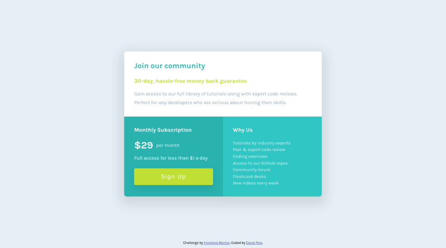
Design comparison
SolutionDesign
Solution retrospective
Please feel free to offer any feed back on anything I could do better! I tried my best to write this card component as semantically as possible. Let me know what you think!
Community feedback
- @VCaramesPosted almost 2 years ago
Hey there! 👋 Here are some suggestions to help improve your code:
- There are only three headings in this component; “Join our community”, “Monthly Subscription”, and “Why us”. Everything else would be wrapped in a
paragraphelement.
- The button was created with the incorrect element. When users click on the button they should directed to a different part of your site; the
anchorelement will allow this to happen.
If you have any questions or need further clarification, feel free to reach out to me.
Happy Coding!🎄🎁
Marked as helpful0@DavidPeloPosted almost 2 years ago@vcarames Thanks for the tips! I have updated the solution accordingly. I appreciate the feedback!
0@VCaramesPosted almost 2 years ago@DavidPelo
I am glad that I was able to help out!
Keep it up!
0 - There are only three headings in this component; “Join our community”, “Monthly Subscription”, and “Why us”. Everything else would be wrapped in a
Please log in to post a comment
Log in with GitHubJoin our Discord community
Join thousands of Frontend Mentor community members taking the challenges, sharing resources, helping each other, and chatting about all things front-end!
Join our Discord
