Design comparison
SolutionDesign
Community feedback
- @grace-snowPosted almost 2 years ago
Hi
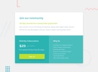
This should definitely be done using CSS grid, it's an ideal challenge for it
Other feedback
- you need to use the font family from the style guide
- every sentence does not need to be in its own paragraph
- Style the whole anchor tag, not the div around it. People need to be able to click on the whole of what looks like the 'sign up' button. Don't do this with explicit height and width, instead use padding on the anchor tag and width 100%.
- add a little margin on all sides of the component, including the bottom, so no edges ever touch the edge of the screen
Marked as helpful1
Please log in to post a comment
Log in with GitHubJoin our Discord community
Join thousands of Frontend Mentor community members taking the challenges, sharing resources, helping each other, and chatting about all things front-end!
Join our Discord

