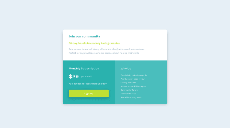
Design comparison
Solution retrospective
First time using grid for the desktop view. Not sure if ive done it in the most efficent way.
Community feedback
- @md5daltonPosted about 2 years ago
Hello maxted83 👋
Your implementation of grid is perfectly fine.
You might have noticed that
.card
stays in mobile design even though there's enough width for it to change to desktop view. This is due to the fact that your media query break-point for larger devices is too exclusive at minimum width of 1440px. You can try to lower that value to 480px, 576px or 768px.Great work on the solution.👌
Marked as helpful1 - @correlucasPosted about 2 years ago
👾Hello @maxted83, Congratulations on completing this challenge!
I saw your preview site and I liked a lot the work you’ve done here, it's almost complete, I’ve some suggestions you can consider applying to your code:
The value you’ve used for the shadow make it too much dark and strong. To improve your box-shadow, you’ve to have in mind two things that make a good shadow,
blur
andlow opacity
for smooth shadows. To improve your current shadow, decrease theopacity
and increase theblur
, try this value instead:box-shadow: 12px 7px 20px 6px rgb(57 75 84 / 8%);
If you’re not familiar to box-shadow you can use this site to create the shadow design and then just drop the code into the CSS: https://html-css-js.com/css/generator/box-shadow/
✌️ I hope this helps you and happy coding!
0
Please log in to post a comment
Log in with GitHubJoin our Discord community
Join thousands of Frontend Mentor community members taking the challenges, sharing resources, helping each other, and chatting about all things front-end!
Join our Discord