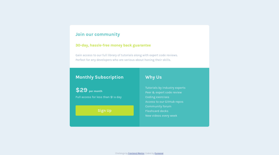
Design comparison
Community feedback
- @VCaramesPosted about 2 years ago
Hey @Kuraanal, some suggestions to improve you code:
- This component should have been built using CSS Grid as the challenge name implies. If you are not comfortable using CSS Grid or do not know how use it, here is a link that is all about how to use CSS Grid:
https://css-tricks.com/snippets/css/complete-guide-grid/
-
The headings are being used incorrectly. There are only three headings in this component; “Join our community”, “Monthly Subscription”, and “Why us”
-
The button was created with the incorrect element. When users click on the button they should directed to a different part of your site; that Anchor Element will allow this to happen.
-
Your button needs to have
box-shadow,cursor: pointer. -
Your button has the incorrect
:hovercolor. You want to check you "style-guide" to get the correct colors.
Happy Coding! 👻🎃
0
Please log in to post a comment
Log in with GitHubJoin our Discord community
Join thousands of Frontend Mentor community members taking the challenges, sharing resources, helping each other, and chatting about all things front-end!
Join our Discord
