Design comparison
Solution retrospective
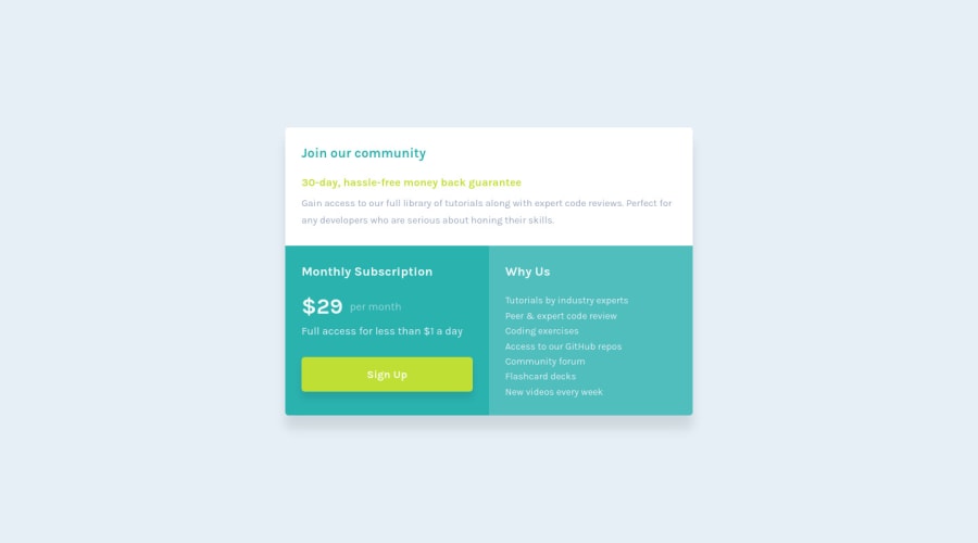
The one issue I had with this project was the main container. As the container shrinks to 320px width, the third section would disappear and even after modifying the margin and line-height for everything else, nothing really worked.
I had an issue with the <main> container causing a vertical scroll effect after it shrunk to a certain width and I did not really know how to stop that issue. I had to change the margin for the <main> container and other elements to finally stop it but I was 50/50 on my solution. If anybody has suggestions what I was failing to see, it would be very helpful!
This also gave me more grid practice as I did not want to use flex for much except the price span.
Overall feedback and/or suggestions of code changes would be greatly appreciated for me to take into my next projects. :)
Community feedback
Please log in to post a comment
Log in with GitHubJoin our Discord community
Join thousands of Frontend Mentor community members taking the challenges, sharing resources, helping each other, and chatting about all things front-end!
Join our Discord
