Design comparison
Community feedback
- @VCaramesPosted about 2 years ago
Hey there! 👋 Here are some suggestions to help improve your code:
-
Remove all the Blockquote Elements you added. They are being used incorrectly and are not needed for this challenge.
-
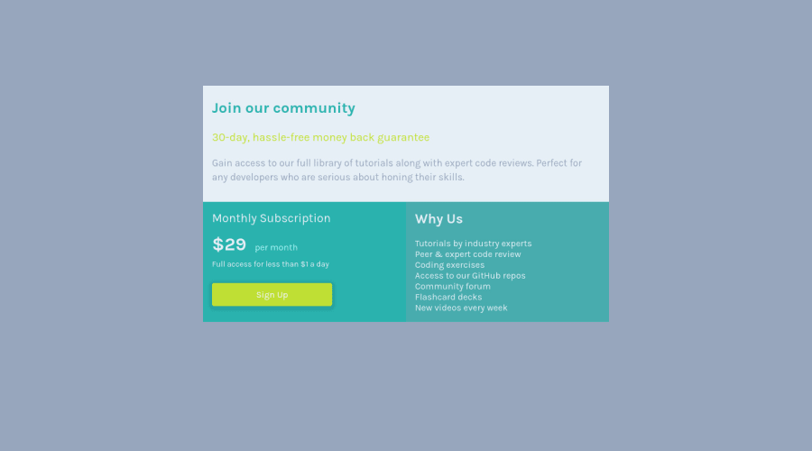
There are three headings in this component; “Join our community”, “Monthly Subscription”, and “Why us”. They need be wrapped in a header element.
-
The button was created with the incorrect element. When users click on the button they should directed to a different part of your site; that Anchor Element will allow this to happen.
If you have any questions or need further clarification, let me know.
Happy Coding! 👻🎃
Marked as helpful0 -
- @AdrianoEscarabotePosted about 2 years ago
Hi Jan Toma, how are you?
I really liked the result of your project, but I have some tips that I think you will enjoy:
- every Html document must contain the main tag, so we can identify the main content, to fix this, wrap all the content with the main tag. HTML5 landmark elements are used to improve navigation experience on your site for users of assistive technology.
- To align some content in the center of the screen, always prefer to use
display: flex;it will make the layout more responsive!
Example:
body {
    margin: 0;
    padding: 0;
    display: flex;
    align-items: center;
    justify-content: center;
    min-height: 100vh;
}
The rest is great!
I hope it helps... 👍
Marked as helpful0
Please log in to post a comment
Log in with GitHubJoin our Discord community
Join thousands of Frontend Mentor community members taking the challenges, sharing resources, helping each other, and chatting about all things front-end!
Join our Discord
