


Vanza Setia• 27,795
@vanzasetia
Posted
Hi, Monica! 👋
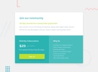
The card is filling the entire of my screen. Are you doing it on purpose?
Some feedback from me:
- Accessibility
- Don't use
headerfor the card content since it is not a full webpage. This is one chunk of content that all belong together and in a real website would sit with other content. - I would recommend using the dollar sign ($) directly instead of using &dollar. The UTF-8 charset supports all symbols including emoji.
- About the Why Us section, use
uland wrap each text withliinstead of usingpelements. - Create a custom
:focus-visiblestyling to any interactive elements (button, links,input,textarea). This will make the users can navigate this website using keyboard (by usingTabkey) easily.
- Don't use
- Styling
- Make the website looks closer to the design by decreasing the size of the card.
- Don't limit the height of the
bodyelement, it will not allow the users to scroll the page if the page content needs moreheight. Usemin-heightinstead.
That's it! I hope my feedback helps!
Marked as helpful
1
Monica• 260
@Monica-MR
Posted
@vanzasetia Hi! I realised the card was not supposed to fill the whole screen when I uploaded the solution. I was confused about the design. Thank you so much for your feedback, there are really hepful for me.
0


