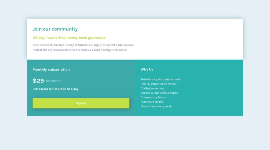
Single price grid component using CSS Grid and Flexbox
Design comparison
Solution retrospective
I'd appreciate any feedback
Community feedback
- @MelvinAguilarPosted over 1 year ago
Hello there 👋. Good job on completing the challenge !
I have other suggestions about your code that might interest you.
- Use
<ul>and<li>for the content under "Why Us": Since the content is a list of items, it's more semantically correct to use an unordered list (<ul>) and list items (<li>) instead of using paragraph (<p>).
- You should use the
cursor: pointerproperty to indicate that the element like a button or a link is clickable.
- The purpose of an
<a>element (anchor) is to create hyperlinks, while a<button>is used for form submissions or interactions. Mixing them in this way can lead to confusion in terms of the intended behavior and accessibility issues for users with disabilities.
- Wrap the page's whole main content in the
<main>tag.
I hope you find it useful! 😄 Above all, the solution you submitted is great!
Happy coding!
Marked as helpful1@doniecodesPosted over 1 year agoHello @MelvinAguilar Thank you very much for this. I appreciate it🙏😌
0 - Use
- @matiasluduena23Posted over 1 year ago
Hi Don coder’s! Nice work! Just one recommendation that might help you.
- You can prevent that an element grows more that you need on the width direction using a max-width. Use this
.grid-container {
  max-width: 700px;   // play with this number
}
Good code!
Matias
Marked as helpful0@doniecodesPosted over 1 year agoHello @matiasluduena23
Thank you very much for this 🙏😌
0 - P@danielmrz-devPosted over 1 year ago
Hello @DonieCode!
Your project looks great!
I have a suggestion that mey help your project look even closer to the original design:
-
Reduce your
div.containerto 800px or so. If you do that, the card won't overgrow. -
Also, I noticed that you used
marginto place your card closer to the middle of the page. Here are two simple and very efficient ways to center elements without margins or paddings:
You can apply this to the body (in order to work properly, you can't use position or margins):
body {
    height: 100vh;
    display: flex;
    justify-content: center;
    align-items: center;
}
Or you can apply this to the element you wanna center:
.element {
            position: absolute;
            top: 50%;
            left: 50%;
            transform: translate(-50%, -50%);
}
I hope it helps!
Other than that, you did an excelent job!
Marked as helpful0@doniecodesPosted over 1 year agoHello @danielmrz-dev Thank you. You're so right. This is helpful 🙏😌
1 -
Please log in to post a comment
Log in with GitHubJoin our Discord community
Join thousands of Frontend Mentor community members taking the challenges, sharing resources, helping each other, and chatting about all things front-end!
Join our Discord
