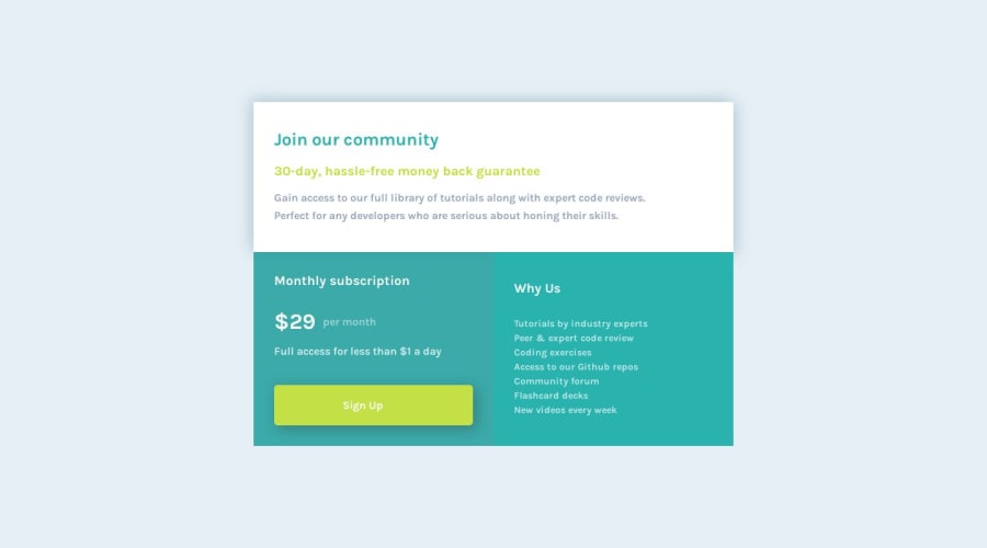
Single price grid component using CSS Grid and Flexbox 2nd attempt
Design comparison
Solution retrospective
Coded with Acode - code editor on smartphone..I couldn't get the border-radius to work on the grid container. I'd appreciate any feedback as well 🙏
Community feedback
- @nilton-manjatePosted 11 months ago
Hi, Donie!
It seems like the border-radius isn't displaying properly on the grid container because elements inside it are extending beyond the container's boundaries, obscuring the rounded corners. To resolve this, try adding 'overflow: hidden;' to your '.grid-container' CSS. This line will effectively hide any content that extends beyond the container's borders, allowing the border-radius to become visible.
.grid-container {
  display: grid;
  grid-template-columns: 1fr 1fr;
  border-radius: 20px;
  overflow: hidden; /* Add this line */
}
Marked as helpful2@doniecodesPosted 11 months agoHello @nilton-manjate I just added that now and it worked. Thank you very much for this. 🙏😁
0 - @Islandstone89Posted 11 months ago
Hey, good job on this challenge. As mentioned above, add
overflow: hiddenon the.grid-container, I did it in DevTools and it worked.A few other things to take note of:
HTML:
-
You need a
<main>, this is important for accessibility. Make.containera<main>. -
There should only be one
<h1>on a page. "Join our community" as a<h1>is OK, but remove the other one.$29should not be a heading, anyways. I would probably have$29 per monthin a<p>, and use a<span>.
CSS:
-
It's good practice to include a CSS Reset at the top.
-
Font-size must never be in px. Use rem instead.
-
The
bodyshould have amin-height: 100vhinstead ofheight- this way, we allow the content to grow beneath the viewport if needed. -
max-widthon.containershould be in rem. -
Remove
width: 80%, you only need themax-width. -
You are centering the
.containerusing Flexbox on thebody, so there is no need for themargin: auto. -
Media queries should not be in px, but in rem. Ideally, you should do the mobile styling as the default, and use media queries for larger screens.
Marked as helpful0@doniecodesPosted 11 months agoHello. @Islandstone89 Thank you very much for this, I really appreciate 🙏🙏😁
1 -
Please log in to post a comment
Log in with GitHubJoin our Discord community
Join thousands of Frontend Mentor community members taking the challenges, sharing resources, helping each other, and chatting about all things front-end!
Join our Discord
