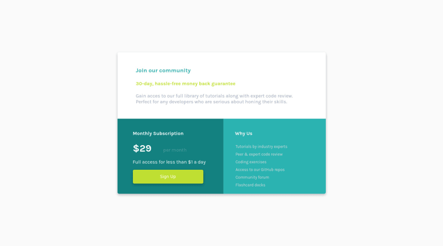
Single Price Grid Component using CSS Flexbox
Design comparison
Solution retrospective
When I'm starting to style the page, should I begin first with the mobile version or with the desktop version?
Community feedback
- @HassiaiPosted almost 2 years ago
Replace <div class="container"> with the main tag <main>,<h3> with <h1> and <h4> with <h2> to fix the accessibility issues . The <h4> within <ul> should be out of the ul and on top of the ul to fix the error issue. click here for more on web-accessibility and semantic html
To center .container on the page, add min-height:100vh; display: flex; align-items: center: justify-content: center; or min-height:100vh; display: grid place-items: center to the body.
To center .container on the page using flexbox:
body{
min-height: 100vh;
display: flex;
align-items: center;
justify-content: center;
}
To center .container on the page using grid: body{ min-height: 100vh; display: grid; place-items: center; }The body has a wrong background-color. Use the colors that were given in the styleguide.md found in the zip folder you downloaded.
Give .top-container, left-container and right container the same padding value fir all the sides and remove the height value from .container
Use relative units like rem or em as unit for the padding, margin, width values and preferably rem for the font-size values, instead of using px which is an absolute unit. For more on CSS units Click here
Hope am helpful.
Well done for completing this challenge. HAPPY CODING
Marked as helpful1@AndreiPostolachePosted almost 2 years ago@Hassiai Thank you for your tips! I've made the changes that you said.
Have a nice day, Andrei
1
Please log in to post a comment
Log in with GitHubJoin our Discord community
Join thousands of Frontend Mentor community members taking the challenges, sharing resources, helping each other, and chatting about all things front-end!
Join our Discord
