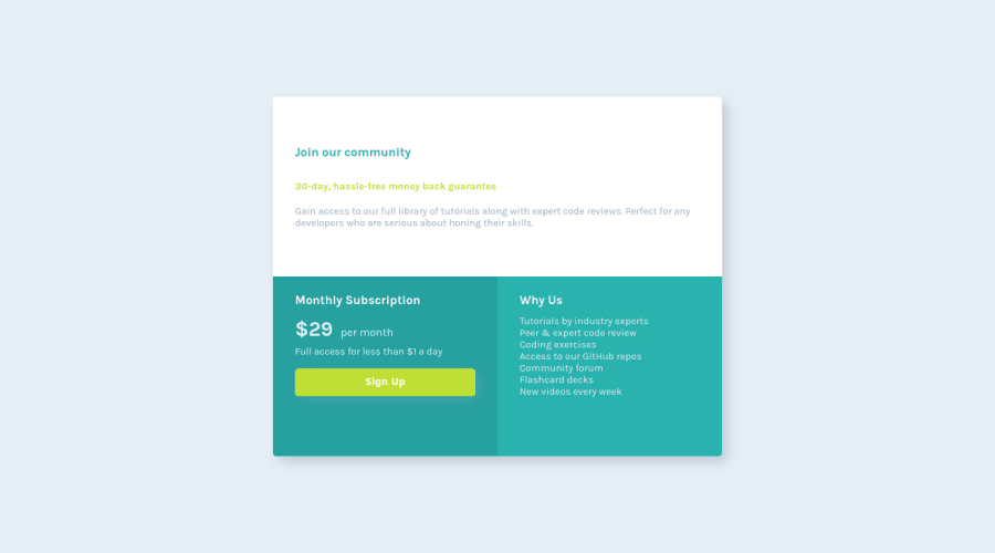
Design comparison
Solution retrospective
Really enjoyed working on this solution, but was a little bit of work trying to make it responsive. But as always, any feedback on the solution is much appreciated :)
Community feedback
- @hyrongennikePosted about 2 years ago
Hi,
Good job on completing the challenge just a few small change more like suggestion on the body rule replace the height with
min-height: 100vh;also remove the height on the container.Once you do the above the container should get smaller. Then add the following to add the same amount of padding to all the section.
.info-section, .subscribe-section, .why-section {
    padding: 2.5rem;
}

This should get your solution closer to the design on desktop. Hope it helps.
Marked as helpful0 - @correlucasPosted about 2 years ago
👾Hello Ayoife, congratulations for your new solution!
🎯 Your solution its almost done and I’ve some tips to help you to improve it:
1.Give the headings for the card the correct size thats around
font-size: 24px:.header { color: white; font-weight: bold; margin-bottom: 0.7rem; font-size: 24px; }2.You made your html structure entirely with
div blocksbut these div doesn't any semantic meaning, for this reason is better you use a better html markup improving your code, for example for each card you use<article>instead of the<div>.✌️ I hope this helps you and happy coding!
0
Please log in to post a comment
Log in with GitHubJoin our Discord community
Join thousands of Frontend Mentor community members taking the challenges, sharing resources, helping each other, and chatting about all things front-end!
Join our Discord
