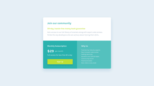
Single price grid component (Tailwind CSS)
Design comparison
Solution retrospective
Hi there 👋, I’m Melvin and this is my solution for this challenge. 🚀
🛠️ Built With:
- TailwindCSS
- npm - prettier
Any suggestions on how I can improve and reduce unnecessary code are welcome!
Thank you. 😊✌️
Community feedback
- @jorditosaPosted over 1 year ago
Hi Melvin,
Excelent work! Just to say something: For anchor elements, it is good practice target "_blank" attribute.
Then, for html markup, probably I would split main element to use it only for "join our community" container, and other two being created as section elements...all as the main part of the webpage, not all is the dominant content.
Finally, probably you have used many arbitrary values...then, could be better developing directly with css or with preprocessor. For example, class p-[1.5625rem], that you repeat often, would be faster to create a variable with that value (:root), and then you do not need to write different times.
I repeat, that is an excellent work! Is just to give some extra opinion, not best, but mine! keep working
Marked as helpful1@MelvinAguilarPosted over 1 year ago@jorditosa Hello! Thank you very much for the valuable feedback, all opinions are important.
I appreciate the time you took to review the solution and write the comment
Regarding the
<main>
element,<main>
is a landmark and can be a direct child of the<body>
tag.<section>
is not a landmark, it is a semantic tag (cannot be a direct child of the body tag) so it should be inside the <main> tag, but since the challenge is a small component, I don't think it's necessary to use <section> and only used <div> to separate each part.PD: I can't have something like this because it would generate the warning in the report:
WARNING: 'All page content should be contained by landmarks'
:<body> <div> <main> <h2>Join our community</h2> </main> <section></section> /* or <div></div>*/ <section></section> /* or <div></div>*/ </div> </body>
Using target
_blank
is to open the link in a new tab, and I think that the link doesn't redirect to any new information. If they were links to other pages like in the footer of this challenge I would use target blank, but in this case I just let it refresh the page. More info: G200: Opening new windows and tabs from a link only when necessary - WCAG 2.0I totally agree that using too many arbitrary values is a bad practice, it's a punishment for trying to make it pixel perfect. Note: Fixed.
Once again, thank you very much for reviewing this solution.
0 - @hector535Posted almost 2 years ago
Tus soluciones son muy buenas, precisas como siempre. Excelente trabajo. Yo conservo la esperanza de algún día llegarle a tu nivel. Ya verás que sí.
Por cierto, quiero que me seas completamente honesto. ¿Es Tailwind tan atractivo como la gente dice? ¿O es puro hype?
2@MelvinAguilarPosted almost 2 years ago@hector535 ¡Muchas gracias por tus amables palabras! Me siento halagado, aunque debo decir que sus últimas soluciones superan mi trabajo. :)
Mi opinión no es muy objetiva, ya que no he practicado muchas maneras de dar estilos, solo SASS, LESS, Bootstrap y Tailwind.
En mi humilde opinión, es verdad que Tailwind ayuda a escribir código CSS más rápido. Solo es cuestión de acostumbrarse a los nombres de las clases. Aunque a algunos les parece que ensucia el código HTML, personalmente a mí me parece más fácil de utilizar.
Nota mental: En comparación con Bootstrap, Tailwind es mucho más flexible y permite más personalización.
Saludos.
1@hector535Posted almost 2 years ago@MelvinAguilar Muchas gracias por sacar un poco de su tiempo para responder mi pregunta. De veras que se le aprecia.
En cuanto a su respuesta, la verdad es que no tienes idea lo mucho que me ha iluminado. Admito que soy de los que opinan que Tailwind ensucia el HTML, pero al mismo tiempo reconozco que las ventajas que ofrece Tailwind suenan bastante atractivas, entre ellas, no tener la necesidad de nombrar/crear tantas clases y como ya has mencionado, la facilidad y rapidez que este ofrece al momento de darles estilos a componentes de UI.
Definitivamente lo usaré en los próximos proyectos de esta plataforma para tener la oportunidad de experimentarlo en persona. Espero no hacer el ridículo frente a tus ojos, y si lo hago, pues, al menos tendrás algo de que reírte.
Un placer, y espero con ansias tus próximas soluciones.
Saludos.
1 - @ahmedyasserdevPosted over 1 year ago
i have nothing to say , i am impressed , it's pixel perfect
1 - @zsoltvarjuPosted over 1 year ago
Hello Melvin Aguilar!
I'm absolutely amazed by how perfect this is! I never would've thought it was possible without having access to the Figma files, and I really love it. Congratulations on such a fantastic job! Can I ask how much time it took you to complete?
Also, in a previous comment, I noticed that you mentioned using the Pixel Perfect extension. I was wondering, what is your approach when using this tool? Do you start by eyeballing the layout and then use the extension to fine-tune it?
And one more question if you don't mind, do you work as a professional web developer?
Thank you very much in advance, you really motivated me!
1@MelvinAguilarPosted over 1 year ago@zsoltvarju Hi there! Thanks for reaching out. To answer your question, it usually takes me around 45 minutes to 1 hour to complete a small project, and an additional hour or so if I want to make sure the design matches the provided files as closely as possible.
In terms of my approach, I usually start by trying to guess the layout and design based on the provided files. Then, I use a tool like the Pixel Perfect extension to adjust the sizes and alignment to ensure everything is as close to the design specs as possible.
I'm currently freelancing on a project, but my personal studio is taking up a lot of my time, making it challenging to balance everything.
If you have any more questions in the future, feel free to reach out to me again. Have a lovely day!
0 - @RicoRIck12Posted over 1 year ago
Hi, amazing solution i want to know how you make it so accurate if it's not a secret of course!<3
1 - @YassineafailaPosted almost 2 years ago
where did you learn Tailwind CSS?? the design looks great, keep going bro
1@MelvinAguilarPosted almost 2 years ago@Yassineafaila Hi!! Honestly, I haven't taken a Tailwind course or watched many videos. I just use the official Tailwind documentation. I'm sorry I can't help you with many links. :(
The official Tailwind CSS documentation: https://tailwindcss.com/docs
4@YassineafailaPosted almost 2 years ago@MelvinAguilar thanks bro, I just want to know if there's some source for learning tailwindcss but , I will just use the official documentation
0 - @i7ectorPosted almost 2 years ago
nice work! you almost have the design pixel perfect and if you did it just by eyeing then that's very impressive. keep up the good work ;)
1@MelvinAguilarPosted almost 2 years ago@i7ector Thank you, I appreciate your positive feedback !
0 - @devaramnyePosted over 1 year ago
Hello,
I've got one question. Would you prefer everyone to start using tailwindCSS? I am a newbie and I am getting confronted with some things I am not used to like scss and I am working currently on a project to implement my first impression with scss which gives me a lot of work right now. I see your work and I am really impressed and want to get inspired so I hope its fine to ask this question.
0@MelvinAguilarPosted over 1 year ago@devaramnye Hello,
Thank you for reaching out! If you're feeling confident with CSS fundamentals, then diving into TailwindCSS can be a great choice. It's efficient and helps produce clean designs quickly once you get the hang of it.
However, if you're still grappling with certain CSS concepts like pseudo-selectors, specificity, media queries, and various layout techniques (like flexbox and grid) you might benefit from spending more time with plain CSS or SCSS.
Sorry for the delayed response! 🙏 I hope this helps, and best of luck on your journey!
0 - @AzkanorouziPosted almost 2 years ago
Hello melvin, great solution congrats on finishing that, I am really surprised by how precisely identical your solutions are to the main design, are you using some kinda app or something to help you get the most accurate size in px? if you do please let me know, and keep it up, your work is really impressive, hope you continue this journey and never give up, good luck.
0@MelvinAguilarPosted over 1 year ago@Azkanorouzi Hi! Thanks for checking it!
There are two options, the easiest one is to become a PRO member and get the designs in Figma, the other option is to use an extension called PerfectPixel to put the preview image on top of the solution I'm making, then I simulate a screen (1440px wide) using dev tools so it looks as close as possible.
1@DivineUgorjiPosted over 1 year ago@MelvinAguilar I appreciate your feedback on this, and your dedication to making your implementations as close to the design as possible. However, I find that the preview design templates provided in the free challenges are too small, hence I find it difficult to match them with my work using the perfect pixel Chrome extension. Please, would you be kind enough to point me in the right direction in this regard, and offer some more explanation or even a video tutorial on how you use the pixel-perfect Chrome extension to implement your designs?
I would be grateful to hear back from you in this regard.
0
Please log in to post a comment
Log in with GitHubJoin our Discord community
Join thousands of Frontend Mentor community members taking the challenges, sharing resources, helping each other, and chatting about all things front-end!
Join our Discord