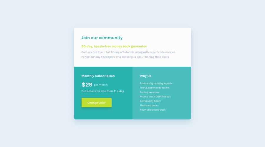
Design comparison
Solution retrospective
This is single price grid component solution please see my solution and give feedback because i want improve my coding skill advance thanks for feedback
Community feedback
- @correlucasPosted about 2 years ago
👾Hello again Faruk, Congratulations on completing this challenge!
Great solution, the component its beautiful and full responsive, amazing! Something to fix is the html markup, Instead of using
div blocksthat doesn't have any semantic meaning you can use<article>that's a better fit for this case and add one<h1>heading to show which is the main title of this page.This article from Freecodecamp explains the main HTML semantic TAGS: https://www.freecodecamp.org/news/semantic-html5-elements/
✌️ I hope this helps you and happy coding!
1 - @hmadamkPosted about 2 years ago
- Well done acouple of notes though
- make sure that all of your page is contained by a landmark examples of landmarks are
header for the top section
main for your main section
section with aria-label to describe why you added this section
footer for the bottom section
for the main section it's required to make users with disabilities to be able to skip right into the content of your site
0
Please log in to post a comment
Log in with GitHubJoin our Discord community
Join thousands of Frontend Mentor community members taking the challenges, sharing resources, helping each other, and chatting about all things front-end!
Join our Discord
