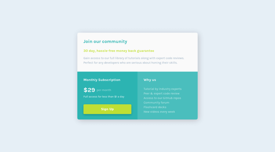
Design comparison
SolutionDesign
Solution retrospective
Community feedback
- @atif-devPosted almost 2 years ago
Hi Elevate, congrats🎉 on completing the challenge. Better take care about following points.
- Always check Frontendmentor Report Generator issues after submitting the project for removing errors and warnings. To avoid accessibility issue "All page content should be contained by landmarks" use code as :
<body>
    <main>
        ---your code here----
    </main>
  <footer>
  </footer>
</body>
(why
mainmatters? Read here)- For centering the container(whole card) vertically and horizontally you can use code as:
body { min-height: 100vh; display: grid; place-content: center; }- When we open GitHub repository link, at right side you will find an About Section. There, also include live preview link of your project. It is better for someone to check your live project while interacting with code.
(Have any questions🧪?reply to this comment😇)
Hope you will find this Feedback Helpful.
Marked as helpful1
Please log in to post a comment
Log in with GitHubJoin our Discord community
Join thousands of Frontend Mentor community members taking the challenges, sharing resources, helping each other, and chatting about all things front-end!
Join our Discord
