Design comparison
SolutionDesign
Solution retrospective
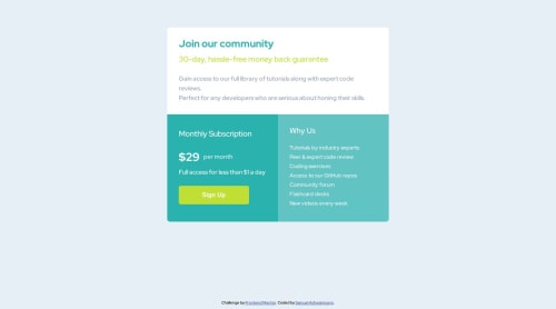
I had a difficulty making the signup button responsive on mobile. Any suggestions?
Community feedback
- @danielmrz-devPosted 11 months ago
Hello Samuel!
Your project looks great!
You can fix your button just by changing its
width
to 100% instead of 80%. Took a look at your code and here's the update:.signup-button { width: 100%; }
Also, your
div.container
should be amain.container
. This won't change anything visually, but it makes your HTML more semantic.I hope it helps!
Other than that, you did an excelent job!
0 - @MelvinAguilarPosted 11 months ago
Hello there ๐. Good job on completing the challenge !
I have some suggestions about your code that might interest you.
- Keep the button at
width: 100%
.
- Avoid using percentage widths in the component; it can cause distortion on some devices. Instead, consider using
max-width: 900px
to adapt to the screen size and prevent excessive growth. Also, set a definedmargin
of 20px to avoid touching the screen edges.
- Utilize
justify-content: center
andalign-items: center
on the body element to center the component correctly.
I hope you find it useful! ๐
Happy coding!
0 - Keep the button at
Please log in to post a comment
Log in with GitHubJoin our Discord community
Join thousands of Frontend Mentor community members taking the challenges, sharing resources, helping each other, and chatting about all things front-end!
Join our Discord