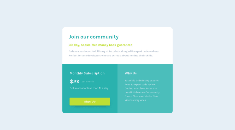
Design comparison
Community feedback
- @catherineisonlinePosted almost 2 years ago
Nice! 🙌🏻
I would also add some transitions for active states (when colors change on hover). It creates more interactivity and makes the project looks cooler. Active states can be done on buttons, links, titles which act like links or anything else, you choose.
You can read more about it here, in case you haven’t done much of it: https://www.w3schools.com/css/css3_transitions.asp
IF THIS WAS HELPFUL PLEASE MARK IT AS HELPFUL 🤩
0 - @VCaramesPosted almost 2 years ago
Hey there! 👋 Here are some suggestions to help improve your code:
- To not only improve your HTML code but to also identify the main content of you page, you will want to wrap your entire component inside the
mainelement.
More Info:📚
- There are only three headings in this component; “Join our community”, “Monthly Subscription”, and “Why us”. Everything else would be wrapped in a
paragraphelement.
- The button was created with the incorrect element. When users click on the button they should directed to a different part of your site; the
anchorelement will allow this to happen.
More Info:📚
- The “Why Us” list needs to be created using an
unordered listelement along with thelist itemelement.
If you have any questions or need further clarification, feel free to reach out to me.
Happy Coding!🎄🎁
0 - To not only improve your HTML code but to also identify the main content of you page, you will want to wrap your entire component inside the
Please log in to post a comment
Log in with GitHubJoin our Discord community
Join thousands of Frontend Mentor community members taking the challenges, sharing resources, helping each other, and chatting about all things front-end!
Join our Discord
