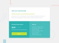
Design comparison
Solution retrospective
Please destroy my work with kind constructive criticism. This was a very frustrating challenge, but learned a lot through the process.
Community feedback
- @FluffyKasPosted about 3 years ago
Hiyo, I'm not here to destroy your work but I'll try to provide constructive advice ^^ First of all, I think you did a great job, your solution looks pretty close to the design. Few things that can be improved:
-
You need to set the font-family for the button, right now it just uses the default. Styling buttons can be a pain ^^ You could also add
cursor: pointer. -
You could increase the left and right padding on the card a bit and perhaps a slightly bigger max-width would look nice.
-
In your next challenge you could try to choose class names that are a bit more descriptive and longer than 3 letters :D Just so people have an easier time following your code :)
-
In the "why" section you're using a p tag with line breaks. Just think, is it really a paragraph that you have there? Or is it a list? :)) Don't use <br> for styling if it's avoidable. The best here would be to use an unordered list and then style it with css ^^
Good luck!
Marked as helpful0 -
Please log in to post a comment
Log in with GitHubJoin our Discord community
Join thousands of Frontend Mentor community members taking the challenges, sharing resources, helping each other, and chatting about all things front-end!
Join our Discord

