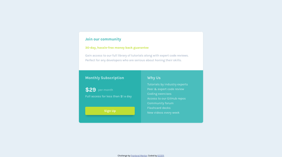
Design comparison
Solution retrospective
If there is anything to improve, please let me know. All feedbacks are welcome!
Community feedback
- @ApplePieGiraffePosted over 3 years ago
Hey there, Eduardo! 👋
Good work on this challenge! 👍 It's a rather simple one but your solution looks nice and is responsive! 😀
Just a small suggestion—I think adding a little bit more to the hover state for the button (such as a subtle change in background color or in the intensity of the box-shadow) would be a nice touch! 😉
And you could have perhaps used a list element for the list of features in the "Why Us" section—but it doesn't matter so much, I guess. 😄
Keep coding (and happy coding, too)! 😁
1@ECCERPosted over 3 years ago@ApplePieGiraffe They are great ideas! I will take the time to improve it with the ideas you gave me. Thanks! I just finished another challenge I hope you can see it too and give me your opinion!
1 - @MojtabaMosaviPosted over 3 years ago
Hi!, well done, just add a litle bit of padding to top and bottom of you main on mobile view.
Keep coding :)
1@ECCERPosted over 3 years ago@MojtabaMosavi Thank you, I will keep it in mind to improve the result! Keep coding too! :D
0
Please log in to post a comment
Log in with GitHubJoin our Discord community
Join thousands of Frontend Mentor community members taking the challenges, sharing resources, helping each other, and chatting about all things front-end!
Join our Discord
