Not Found
Not Found
Not Found
Not Found
Not Found
Not Found
Not Found
Not Found
Not Found
Not Found
Not Found
Not Found
Not Found
Not Found
Not Found
Not Found
Not Found
Not Found
Not Found
Not Found

Submitted

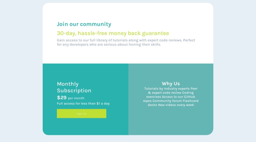
Single price grid component master ( Made using flexbox )

KingSkyβ€’ 190

@KingSkyros

Desktop design screenshot for the Single price grid component coding challenge

This is a solution for...

  • HTML
  • CSS
1newbie
View challenge

Design comparison


SolutionDesign

Solution retrospective


Hello πŸ‘‹ , I am finally done with this project this is one of my projects made with the use of flex-box πŸ’ͺ.

Some of the things I learned were how to use Flex better and how or where to use them. I mostly learned everything from this interesting blog https://fedmentor.dev/posts/padding-margin/ by Grace.

All suggestions on how I can improve my code or project pls do πŸ™‹β€β™‚οΈ.

Community feedback

ocΓ©aneβ€’ 230

@Ocece77

Posted

Hi πŸ™ŒπŸΏ Your project is great, I noticed you followed the design on mobile, I don't know if it was intentional, in any case it's not bad πŸ˜ŽπŸ‘πŸΏ

There are a few corrections to optimize your code 🌿:

First

When you import fonts from google fonts you can put them all in one link, just select the font with the weight you want and in the top right tab "select families" and voilà ✨

take a look at this YouTube short that shows how to do it: https://youtube.com/shorts/VPHqcvYTy3A?si=QBKYU4yzmF25RBv2

Second thing : You can use variables for colors, animation, family .. and store them in root:

Using variables in CSS with the :root selector allows you to store and reuse values throughout your stylesheet, leading to easier and more consistent styling across your entire website β˜•οΈ

Here some cool ressources to help you 😎 :

Third thing : You can use transition on your button so that when the user no longer hovers over it, it returns smoothly to its initial state. By applying a transition: property to the button's CSS, you can control how properties change over a certain duration when the user interacts with it πŸ’†.

For exemple in your button:hover{} you can add a transition : 0.3s ease

While you can technically add the transition property to the :hover state of the button, it's more common and efficient to apply it directly to the button's base class like this :

.button{ 
    padding: 15px 6rem;  
    background-color: hsl(71, 73%, 54%); 
    border: none;  
    display: inline-flex;
    color: #fff; 
    font-size: 150%; 
    font-weight: 200;
    transition: 3s ease; 
} 

.button:hover{ 
    border-radius: 2em; 
    border: 2px solid white; 
    color: black; 
    background-color: transparent;
}

I noticed that your transition is a little bit long , transition more than 1 seconds is often considered too long for a transition duration because it can lead to a sluggish or delayed user experience . In many cases, users expect interactions and animations to feel snappy and responsive πŸƒ. A 3-second transition could potentially frustrate users by making the interaction feel slow and unresponsive 🫨.

Here some ressources about it πŸ“„:

Keep practice and NEVER GIVE UP !

Here a video that can motivate you :

https://youtu.be/dzdiMRovyK0?si=jRfCxcNMvsLNk1ab

Marked as helpful

0

KingSkyβ€’ 190

@KingSkyros

Posted

@Ocece77 Thank you for all the help πŸ‘, and also the mobile view was intentional πŸ±β€πŸ’» I just wanted to test my mobile progress.

1

Please log in to post a comment

Log in with GitHub
Discord logo

Join our Discord community

Join thousands of Frontend Mentor community members taking the challenges, sharing resources, helping each other, and chatting about all things front-end!

Join our Discord