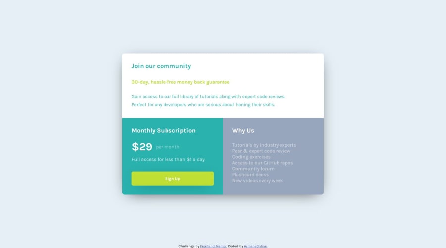


Design comparison

Solution retrospective
I've worked using Grid. All good.👍
Community feedback
- @VenusYPosted about 1 year ago
This is a very good solution to this challenge! You've done a great job at making this page look like the design.
One thing I'd like to point out on the desktop version is that when you shrink the viewport height to the point where the viewport is smaller than the card itself, part of the card gets cut off.
This results in the user not being able to read the content of the top section of the card, which impairs the user experience of your site.
The property that's causing your site to behave like this is the hard-coded height of 100svh set on the body element.
To fix this, you can simply change the
heighttomin-height:body { height: 100svh; ❌ min-height: 100svh }This will give the body element an initial height of 100svh but still allow it to expand if the content height exceeds the height of the viewport.
I also noticed that the desktop version lacks padding on the body element.
While this isn't necessarily a huge problem, whitespace is good for user experience as it adds visual balance to your site and also improves readability.
Other than that, you've done an incredible job with this solution!
Hope this has been helpful to you! :)
Marked as helpful1@AymaneOnlinePosted about 1 year ago@VenusY That was really helpful from you. Thank you very much!
1@VenusYPosted about 1 year ago@AymaneOnline No worries! I'm glad I was able to help you out. :)
1 - @Bishalsnghd07Posted about 1 year ago
Hi, @AymaneOnline
All good, Amazing work🎉
One suggestion from my side, you can do lighthouse testing by inspecting in your web page, it will test your performance of your web page it will test how much time your web page is taking when loading, will test best practices, accessibility and SEO. So, it is very good tool to check your performance of web page.
Hope so this tips will help you. Nice work👍
You can check my solution also, for your reference - https://single-price-grid-component-mu-one.vercel.app/
Marked as helpful1@AymaneOnlinePosted about 1 year ago@Bishalsnghd07 Thank you for pointing that out!
0


Please log in to post a comment
Log in with GitHub
Join our Discord community
Join thousands of Frontend Mentor community members taking the challenges, sharing resources, helping each other, and chatting about all things front-end!
Join our Discord