Design comparison
Solution retrospective
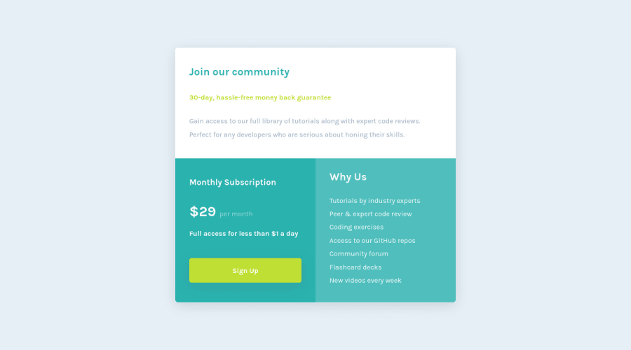
Hello everyone! This is my solution for Single price grid component. Feedbacks are appreciated.
Community feedback
- Account deleted
Hey there! 👋 Here are some suggestions to help improve your code:
- You are overusing the
sectionelement. A simpledivwill do.
- There are only three headings in this component; “Join our community”, “Monthly Subscription”, and “Why us”. Everything else would be wrapped in a
paragraphelement.
- The button was created with the incorrect element. When users click on the button they should directed to a different part of your site; the
anchorelement will allow this to happen.
More Info:📚
If you have any questions or need further clarification, feel free to reach out to me.
Happy Coding!🎄🎁
Marked as helpful1@nerdy-guyPosted over 2 years ago@vcarames Thanks for your feedback. Regarding
<section>aren't they better thandivfor semantic and accessibility? Should I replace all of them with div?0Account deleted@nerdy-guy
The
sectionelement really has no semantic meaning. It is the same as adiv. the only difference is that thesectionelement is used to define groups of related content.So for this challenge you "could" wrap the entire component in a
sectionelement since they are all related.Marked as helpful1 - You are overusing the
- @thisisharsh7Posted over 2 years ago
Hi Ahmed Arafa, well done! Your solution looks perfect.
Your web page is well designed and it is responsive at different widths. You use flexbox and grid in your solution which is the base for any responsive layout. Your codes are clear and easy to be read by anyone. Your work is excellent.
Marked as helpful1
Please log in to post a comment
Log in with GitHubJoin our Discord community
Join thousands of Frontend Mentor community members taking the challenges, sharing resources, helping each other, and chatting about all things front-end!
Join our Discord
