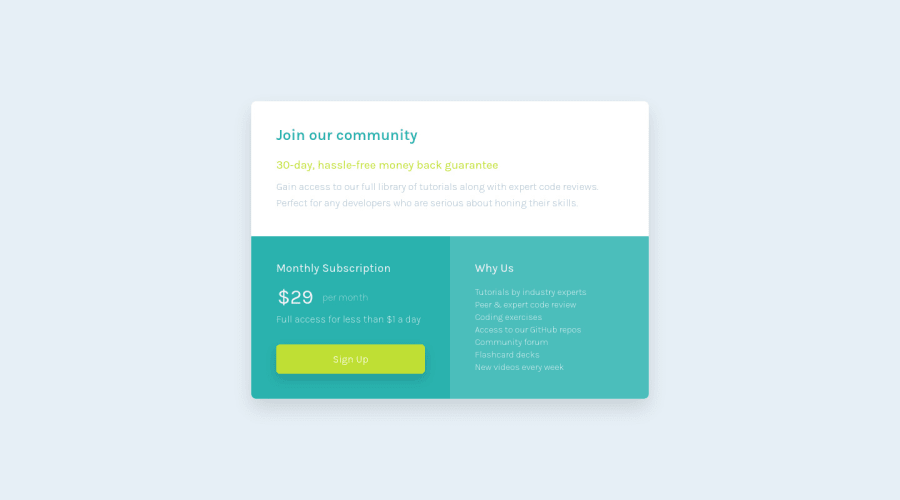
Design comparison
Solution retrospective
...made with a lot of love 🤘🏻🙂
Community feedback
- @correlucasPosted over 2 years ago
👾Hello Cheosphere, Congratulations on completing this challenge!
The correct color for this shadow that is
blueishisbox-shadow: 0rem 0.9375rem 1.875rem rgb(0 81 171 / 15%);the one you've used is gray. Add the correct color for the background, that in this case isbackground-color: #F2F2F2✌️ I hope this helps you and happy coding!
Marked as helpful1 - @OhSorrowPosted over 2 years ago
👋 Hey dear Cheosphere! Congratulation for completing this challenge! It looks great!
One suggestion I have is to use
litags inside aultag instead ofbrtags inside aptag in the following piece of your HTML code:<section class="card_content_right"> <h2 class="card_content_right_title"> Why Us </h2> <p class="card_content_right_text"> Tutorials by industry experts<br> Peer & expert code review<br> Coding exercises<br> Access to our GitHub repos<br> Community forum<br> Flashcard decks<br> New videos every week </p> </section>Happy coding ;)
Marked as helpful1@CheospherePosted over 2 years ago@OhSorrow Hi Aram, you are absolutely right, I am going to change the code using lists as you indicate. Thank you very much for your feedback!!!
1
Please log in to post a comment
Log in with GitHubJoin our Discord community
Join thousands of Frontend Mentor community members taking the challenges, sharing resources, helping each other, and chatting about all things front-end!
Join our Discord
