Design comparison
Solution retrospective
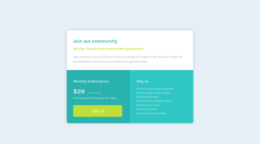
Not perfect or the most elegant but I think I figured it out. Tried doing this with not grids and that was not going to happen so I used a display: grid; (not a flexgrid). Fiddly on the positioning.
I never did get the "per month" to center align vertically. /* update */ Applied the feedback I had received (Big Thanks!) and corrected some issues.
- Dropped unnecessary Div's
- Changed how I switched sizing and padding based on screen size. Mobile looks right I think.
- Got the Pricing line to vertically align
- Changed the Why Us list to a UL/LI
- General clean up
- Did not change to BEM naming convention but am looking at how it works
Community feedback
- @SzymonRojekPosted almost 4 years ago
Hi Andy,
Welcome here, well done :D
I have checked your project, mainly HTML structure and RWD by the inspector in my browser, a few tips below:
- instead of section class="card-container" you can use the main tag just to indicate the main content on a page;
- don't have to create that kind of classes like padding-small, padding-large;
- generally I'd recommend learning about BEM naming convention and how to create readable and descriptive classes => in the future you will get lots of gratifications from it;
- if you will use the grid you don't need this div class="card-subscription";
- "per month" in the middle of the price: don't have to use two spans inside the p, one will be enough. In my project I have used two paragraphs but now I think it will be better to use just a one span inside of the paragraph;
- well done with the link (lots of people used a button but in my opinion the link has got a better reason to be here), anyway check this article from the blog CSS-tricks:A Complete Guide to Links and Buttons;
- third box: instead of many p it will be better to use ul > li;
- reset the CSS styles: * { margin: 0; padding: 0; box-seizing: border-box; };
- you gave explicit width on mobile size: that's not a good practice especially that you want to use the flexbox or grid. It is essential to understand well the height and width vs min-height/max-height & min-width/max-width. You shouldn’t need to give items height unless they have a background or absolutely-positioned or floated elements within them that would not normally be accounted for in the height of an element. Experienced developers use min-height and min/max-width more than anything else. It allows elements to grow and shrink;
- check a project i your browser on different devices by using the inspector => this is a good practice to see the project at the end, now there is a problem with a margin an generally project doesn't look well on mobiles.
That's from me.
Ps. Please, don't forget to upvote any comments on here that you find helpful.
Greetings :D
3@racurleyPosted almost 4 years ago@SzymonRojek Thanks for taking the time to provide the feedback. Super helpful. I think I applied everything suggested other than BEM naming (need to figure it out). And, I couldn't get the pricing line to work with a single span so I went back to my two. But, I did get the proper vertical alignment. Definitely seems much cleaner than before.
0 - @grace-snowPosted almost 4 years ago
Great feedback from Syzmon there. I agree your content is too narrow on mobile. A max width would serve you better there than setting a percentage width.
Looking at the html, it looks pretty good. I'd mainly swap out all those paragraphs in the why us section for an unordered list. That makes a lot more semantic sense.
Other thing I'd recommend tweaking ins the shadow. Yours looks quite different to the original design.
Good luck with your learning, you're doing well here
2@racurleyPosted almost 4 years ago@grace-snow Thanks. I think I have the shadows closer now. Went with the UL/LI too. Appreciate the feedback.
0 - @racurleyPosted almost 4 years ago
Yikes. I opened it on my phone. Kind of narrow. Need to go think about that.
0
Please log in to post a comment
Log in with GitHubJoin our Discord community
Join thousands of Frontend Mentor community members taking the challenges, sharing resources, helping each other, and chatting about all things front-end!
Join our Discord